This blog forms the learning log for my OCA photography degree module Photography 1: People and Place. My learning logs for other modules and my personal photo-a-day blog can be found through the tabs below.
Thursday, 28 April 2011
On Street Photography
On Street Photography
Street Photography guide from Photo.net
Street Photography Now Project
Monday, 25 April 2011
First steps in street photography
I am one of the many who find the idea of taking photos of complete strangers who have not given explicit consent quite daunting. I have managed to convince myself – rightly or wrongly – that part of the problem is the very intimidating and obvious nature of a large black d-SLR, and treated myself to an Olympus PEN E-P1 with a 17mm lens (34mm equivalent). So that’s my technical excuse dealt with.
Before I have a proper stab at Exercise 9 I thought I’d take the camera out and get a feel for what street photography involves. I’d already picked up a couple of tips from various websites and blogs so the camera was set to manual focus at about 10 feet to reduce the shutter lag and f/8 to get reasonable depth of field.
A couple of things became quite quickly apparent:
- with a 17mm lens you have to get very close to fill the frame with a subject. I knew this but had not really considered the implications for street photos;
- a fairly quiet morning in Wells is not packed full of opportunities, nor is it easy to be inconspicuous in scarcely populated streets;
- the camera noise is less conspicuous than I expected, particularly if there is any traffic or other noise,
- shooting from the hip is pretty hit and miss – even shooting with the camera hanging round my neck is pretty vague;
- the optional hot-shoe viewfinder is considerably easier to use than the screen on the back; and,
- for a beginner it feels easier to sit in one place and wait for opportunities rather go hunting.
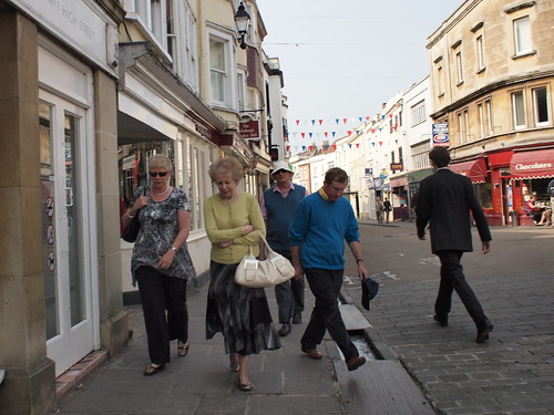
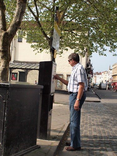
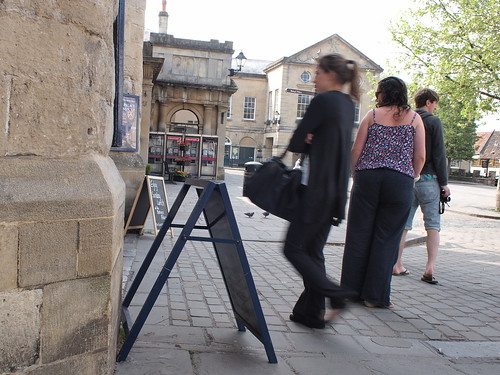
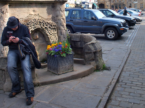
I did manage a few photos that I’m prepared to share, although I make no great claims for their quality. Of the four below I had to crop a couple quite heavily to compensate for the small size of the subject.
Thursday, 21 April 2011
At last: Assignment 1: A portrait
This first assignment requires 5-7 different portraits of a single individual. I’ve chosen myself as a subject because I find the idea of self-portraiture quite intriguing. There’s an interesting introduction to self-portraiture in traditional art here which notes that:
“…artists have modelled for themselves in their own works of art. Whether it is an in-depth exploration of the artist’s own psyche or simply because as a model, the artist is clearly the cheapest and most available.”
There are elements of both of these positions in my reasons for choosing self-portraiture. I travel a lot, and have only a small circle of easily accessible friends so self-portraiture certainly makes it more straightforward to progress.
I also think that self portraiture makes it easier to explore the meaning/purpose of portrait photography – assuming that this actually goes beyond making a nice picture. In particular it removes one of the variables from the subject-photographer-viewer equation – reducing it to subject-viewer. It’s reasonable to assume in self-portraiture that the agenda of the subject and the photographer are the same. Whether this makes for a more objective or insightful photograph is a moot point but if it does anything it should reinforce the image the photographer/subject is trying to portray. If done successfully the viewer should then be left with a clearer view of the manner in which the subject wishes to portray themselves.
The final reason for choosing myself as a subject is that it allows me to play with the end result more freely – I don’t have to risk offending anyone.
The photos
The seven photos I’ve chosen can be roughly split into two groups – traditional portraits and some experimental shots. One of the challenges I had in choosing the shots was that I wanted to provide a progression from standard portraits to something more unusual or interesting. They were all (bar the last two) composed using live view on the flip out screen of my camera.
First up then is a very standard casual portrait:
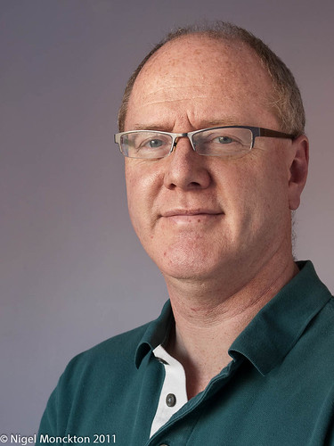
The basic details are f/5.6; 1/15sec; ISO 200; 31mm (62mm equivalent FOV). The light was diffused skylight coming from the left through a large window. The background was a plain bedroom wall. I used a white sheet on the right to lighten the shadows and also held a white reflector out of shot at stomach level to add some extra light under my chin. The camera was fired using a remote control with a 2 sec delay to give me a chance to move it out of shot.
Overall this is pleasing but unremarkable – not dissimilar to the shots the kids have brought home from school over the years. The 2-second delay means that my expression is always a bit of a surprise as the live view disengages during shooting. As a result I needed to take about a dozen shots before I got an expression that feels and looks natural to me – the delay was just long enough that the smile became too cheesy or I lost it and simply looked stern.
As a portrait it reveals a modest amount about me – I’m clearly male, slightly overweight and middle aged. The clothing suggests I’m fairly conventional. I would like to think that the facial expression suggests a relatively easy going nature and that I might find the process vaguely amusing– I certainly did not intend anything more than this – indeed it’s why I chose this particular shot – it’s pretty much how I would choose to portray myself. The pose itself also supports this – if my body had been square to the camera the shot would have looked more confrontational.
For the next shot I have chosen to pull back to a much broader view with considerably more context:
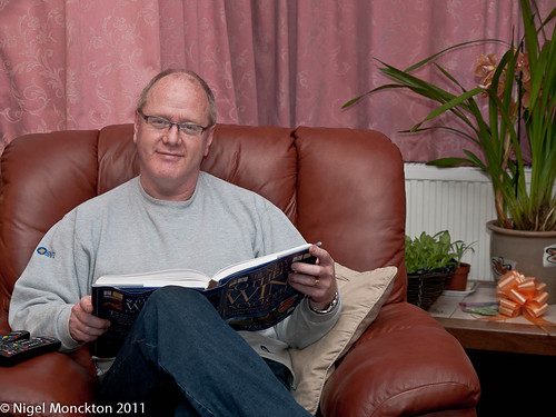
The basic details are f/4; On-camera flash; ISO 200; 43mm (86 mm equivalent FOV). The flash was pointed vertically at the ceiling of a fairly large living room which has resulted in lighting that could perhaps be criticised for being a bit flat but is overall relatively pleasing. The camera was again fired using a remote control with a 2 sec delay to give me a chance to move it out of shot.
The first couple of shots I tried in this setting used a small laptop as a prop rather than the book – I had hoped that the light from the screen would provide some helpful fill under my chin. However it was not really bright enough to be helpful, and it produced a relatively featureless and ugly rectangle on my knee. I tried a couple of poses without my legs crossed but all that did was emphasise how ‘slightly’ overweight I am. I also tried a couple of shots with my head/eyes directed at the book, but they were less engaging than this final version. In particular this feels like a candid shot – I’ve just looked up from a book, and the pose is quite open because the book forces my arms apart, and the disparate height of the shoulders adds to the relaxed feel.
The shot was composed using the standard rule of thirds to direct attention towards my face – the angles of my shoulders help in this respect. There is much more contextual information than the first shot – there is a hint of my personal interests (unless of course I’m simply posing), and a wedding ring perhaps reveals my marital status. There is also a large bow on the coffee table…is it someone’s birthday perhaps?.
By way of a contrast the third shot is much closer in, and in some ways considerably more intimate:
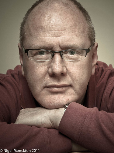
The basic details are f/5.6; On-camera flash; ISO 400; 54mm (108mm equivalent FOV). The flash was again pointed vertically at the ceiling – this time in a relatively small hotel room – so the camera was considerably closer to me. As a result there are noticeably stronger shadows in this shot than the previous one. In spite of the closer camera position and the longer focal length I also cropped in rather more tightly to produce this shot. It is also quite heavily processed. I used a preset downloaded from the internet as a starting point to get the desaturated and warm toned look of the shot. I then did quite a lot of dodging in Lightroom to darken highlights on my forehead and along the bridge of my nose and the top of my wrists.
It was one of a series of shots in a variety of poses – and was one of the few I was really satisfied with. Particular problems included my arm positions looking unnatural, odd facial expressions and unpleasant shadows. I tried to overcome the latter by using a reflector in my lap (or closer still to my face) whenever possible to provide a form of clam-shell lighting. In the end I rejected these and settled for this one.
The direct stare and relatively sombre expression (which sits well with the toning of the shot in my view) give me a rather contemplative feel – worried perhaps? The crossed arms – a classic defensive pose – also serve to suggest some thought processes that I’m unwilling to share. When you compare this with the first shot it’s this sort of contrast which makes me wonder what, if anything, we can really learn about a person’s character from a single portrait.
Another change of flavour for the fourth shot. Again a relatively standard portrait – and in the same setting as the first shot, but this time I have tried for a corporate or PR feel to the shot.
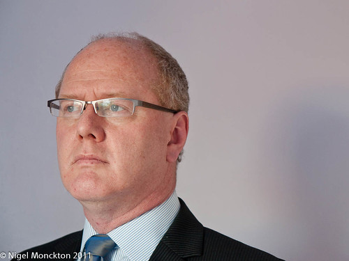
The basic details are f/3.4; 1/10sec; ISO 200; 46mm (92mm equivalent FOV). The lighting set-up was also as for the first shot, except I am rather closer to the background so my shadow is visible to my right.
Again this is one of a series – another example is posted over on my photo-a-day blog. The challenge I found in this series was getting an expression which conveyed the feel of being dressed for business – not too smiley, not too serious. the example on my other blog falls into the latter category. It is far too serious, stern even, to properly represent me.
In composing the shot here I deliberately chose to place myself to one side of the shot – I’ve seen this approach in lots of corporate imagery. To my mind it has an air of abstraction – the subject doesn’t really have time to be there and his mind is elsewhere – the slight upward tilt of the head adds to this. Reading the photo in the traditional L to R manner takes us into empty space – the subject is already off doing other things, and all we're left with is a shadow.
Its instructive to compare this with the same image flipped horizontally:

In this version we still have the abstraction, and perhaps thoughts on the future but the fact the the subject is pointing more conventionally to the right gives a feel that he is marching out of the picture to resolve a problem. In the first example the subject has never really been with us, in this second example, he’s been here, but he really needs to be somewhere else.
It’s also worth noting that, in spite of the formality of the shot, and the clear business feel, in reality I was wearing jeans and the shirt was not tucked in – a full length shot would have been very, very different. Because this is a self-portrait I have been able to choose not only the mask I’m wearing, but the manner in which I portray it. Interestingly though, I felt the need to use a shirt which required cuff-links to help set the mood in my own mind.
Until now the shots have been fairly conventional portraits, even if simple changes to scale, pose and props have produced quite different styles of image. The next example is very close-up.
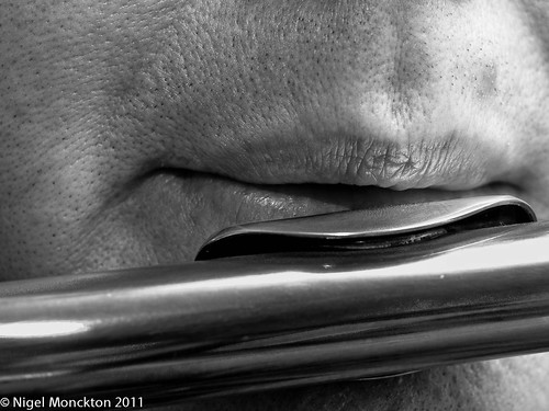
The shooting details are: f/5.6; On-camera flash; ISO 400; 50mm (100mm equivalent FOV). As previously I have used bounced flash, and in this example I have cropped in and straightened the photo to concentrate more fully on the lips. I chose to convert the shot to black and white to manage some troublesome coloured reflections in the flute and the increased the contrast to produce a little more drama. Composition at this scale was quite challenging and I rejected a number of shots with slightly wider views of my face.
Given the very small amount of context, a surprising amount of information can be surmised. Obviously (unless I am deliberately misleading the viewer) the subject has an interest in music, is male and not young (from the skin texture). There is little emotional content, although there is perhaps a hint of sadness because of the similarity between the mouth shape and a sigh.
I’m not sure in my own mind whether the specular highlights are too large but they will almost inevitably be a challenge on a curved reflective object.
Becoming a bit more experimental, I wanted a mirror shot that showed me holding the camera. I have taken several of these in recent months as part of my photo-a-day project, but used very few of them as they always seem a little dull and false. However, this one is rather different. I took it at about the same time as I applied for this course.
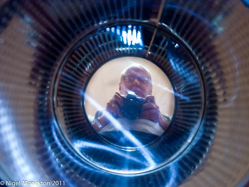
Shooting details are: f/4;1/6sec (2/3 stop underexposed); ISO 400; 29mm (58mm FOV equivalent). The lighting is low wattage domestic fluorescent (energy saving bulb) and the reflection is in the base of a chromed steel laundry bin constructed a little like a washing machine drum. I braced the camera strap taught against my neck and relied on that and IS to achieve a sharp image – I focussed on my face in the reflection.
It is difficult to claim that this shot provides much insight directly although it does point to my occasional eccentricity. I like the interplay of the reflections, the blue flashes (caused by adjusting the colour balance to achieve reasonable skin tone and playing with the sliders for the blue channel) and the overall weirdness of the shot. It reminds me of an early ‘70s Dr Who special effect.
I was surprised to find that a colleague that I showed the shot felt that it summed me up very well – I was holding my camera and the shot was a little weird!
The last shot takes playing with my portrait even further.
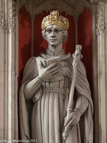
The shooting details for the statue are: ambient light in York Minster; f/4.5; 1/20sec; ISO 800; 54mm (108mm FOV equivalent). the face was taken from an unused shot in the series that produced my third shot, above. Using Photoshop Elements I copied the face, pasted it into a layer in the statue image, then flipped, rotated and distorted it to fit roughly the eye and mouth locations on the statue. I converted it to black and white and then blended it using ‘multiply’ finally I tidied the image by some levels adjustment in the face layer, and some cloning to more effectively blend the glasses and the chin line.
The blend is not perfect – there is a little too much contrast in the face because my PS skills are not quite there yet, but this would probably improve with practise, and perhaps by shooting a self portrait in the same lighting as used for the statue.
Unsurprisingly, given that I am an archbishop, the pose is quite formal and serene, with the props providing plenty of clues to my ’occupation’. The other thing that has happened is that the structural detail revealed by the lighting of the statue has imposed itself on my face so that my identity is quite heavily disguised. My daughter claimed to be able to recognise me, but my wife couldn’t. Maybe there is a metaphor tucked away there somewhere as my identity is subsumed into that of another person.
An alternative technique to a similar end is to take a full portrait and blend it with a stone texture layer. I didn’t try this as I was keen to see the effect of converting myself to an ex-archbishop. The technique probably bears some comparison with the tableaux photography of the early years of photography, where people played out scenes in costume, and perhaps even more crudely the ‘head-through-hole-in-a-backdrop’ type photos that still occur in some fairgrounds.
This has the potential to be the first of a series – I shall be keeping an eye open for interesting statuary. As an idea I can see some parallels with Cindy Sherman’s movie stills series.
Overall thoughts
The first thing that strikes me about this set is that there is no outdoor photography. I did try a couple of takes of myself involved in gardening,but was not particularly happy with the results – I never seemed able to find the right lighting conditions when I had time available for photography. There are opportunities later in the course to address this, and I will also be using my photo-a-day blog.
The next issue is that most of the interior shots are taken with simple on-camera flash bounced from the ceiling. I believe I have produced some variety from that set-up, but this is an area I would like to develop in the coming months as the opportunities present themselves. The Strobist website offers a range of useful ideas to help me develop this area of my work.
The final area for improvement is to develop my understanding of portraiture in general. As noted above, I’m unconvinced about the ability of a photo to genuinely reveal character, and this is something I would hope to explore further in this and future courses.
Wednesday, 20 April 2011
Thinking out loud about Cindy Sherman and the meaning of ‘portrait’
Cindy Sherman is an American photographer who is renowned for her self-portraits in styles borrowed from other genres – ‘50s American movies, centre-folds, historical portraits etc. Much of her work is considered to draw attention to the stereo typing of women.
It’s the self-portraiture that attracted me to her work, as I’ve been working on self-portraits for assignment 1. Her Wikipedia entry attributes a quote from her in the New York Times as follows:
"I feel I'm anonymous in my work. When I look at the pictures, I never see myself; they aren't self-portraits. Sometimes I disappear."
This is an interesting statement – if a photo of her, taken by her, is not a self-portrait, then what is it? This website, which is an unofficial Sherman tribute site proposes that her photos are not portraits because they do not represent a real person, simply a type. I can see that this suggestion has some parallels with acting. If I go to the Royal Shakespeare Company I am clearly not watch King Lear in the flesh, but equally I am not watching the actor. I am watching an actor who has had part of his personal character subsumed by the role, but at the same time he has developed Lear by adding some of his own feelings and reactions to the part.
Taking this back to the original question I’m not sure the photos are purely ‘type’. Presumably she brings part of herself to them (since she is essentially acting the type) and they impose some of themselves on to her for the duration of the photo. If we take her statement above at face value we could argue that they so successfully impose themselves on her that her personality disappears from the image. Even so I am still left to wonder why she chose those ‘types’ – her input is in the choice of type unless they were simply random selections based on available props.
Is it unreasonable to assume that the types might tell us something about her in spite of the absence of ‘her’ from those shots? Bringing this question back home, could it be that a careful selection of ‘types’ or other substitutes for my personality could produce a valid series of photos which provide an insight into the way I think and feel?
I’ve got an idea forming for a series of which involves merging my face with statues of people or objects that particularly interest me. I’ll be submitting the first with Assignment 1 in the next couple of days, but there’s a germ of an idea here that seems worth exploring further.
Saturday, 2 April 2011
PnP Exercise 8: Varying Pose (ii) Lying on a bed
As with part (i) I’m the subject for this exercise – all the shots were in a single sitting, and I used a book as a prop because lying on a bed staring at the pillow looked unnatural. As before all shots were taken with bounced on-camera flash.
The first three variations of the basic pose are here:
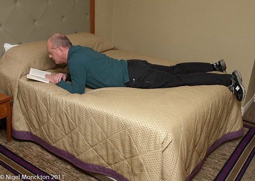
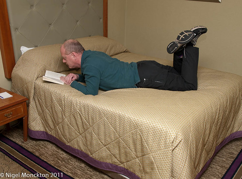
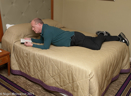
The first pose looks reasonably natural, and is one I sometimes adopt when reading in hotel rooms, whereas the second looks, to me at least, a little odd from the angle used. It also felt a little uncomfortable, although it is quite a common pose in magazines to indicate relaxation, where it is more sometimes used head-on with just the feet showing above the head.
The third pose is perhaps the most natural looking. The crossed legs look less ‘arranged’ than the first shot, and the higher body position appears more natural for reading.
A quite different impression is given if the book is removed and the head is also lying on the bed.
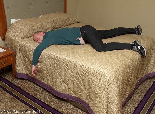
The dishevelled clothing, the limp arm over the side of the bed and the splayed legs clearly convey exhaustion or, less flatteringly, drunkenness. This is another classic example of how a photo can be used to communicate an agenda, or convey a message different from reality. If this were the only shot someone had of me it is likely they would reach a different conclusion about me than if the following were the only shot they had.
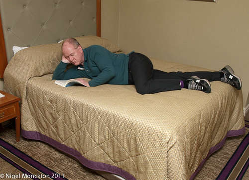
This is by far the most natural looking and most pleasing shot of this series. The slight rotation to half lying on my side and the head propped on one elbow is clearly comfortable, and I am ‘clearly’ engrossed in the book.
All of the above shots lack eye contact, which makes them appear – given that this is clearly a private room – somewhat voyeuristic. Eye contact removes this sense at a stroke:
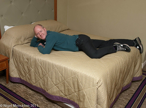
In this shot I a clearly aware of being photographed – perhaps even a willing participant. The absence of any other prop suggests that I may just have woken from a nap, but a similar sense of engagement with the photographer would have been achieved if the book had still been in place.
PnP Exercise 8: Varying Pose (i) Standing
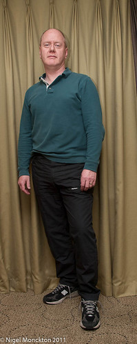
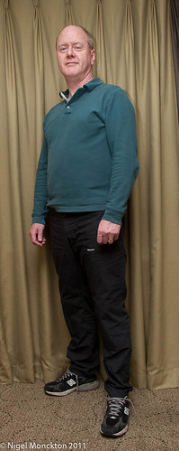
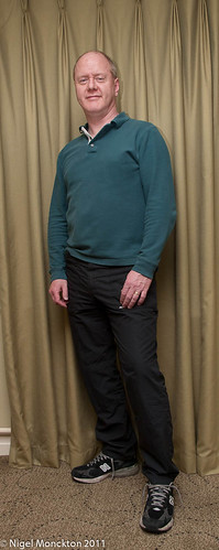
For this exercise I have used myself as the subject, and chosen as my three basic positions lying on my front (on a bed), standing and sitting. I have also chosen settings with a minimum of props so that the changing effect is largely due to the change in pose. All shots were taken with the camera mounted at hip level on a tripod and fired by a remote control so that I was not constrained by the self-timer delay. Lighting in each case was flash bounced from the ceiling
Standing.
From left to right I transferred my weight from my front to my back foot. The only clear difference is where the weight is evenly balanced, because of the absence of a bent front knee. The bent knee pose looks very relaxed – which shows appearances can be deceptive because the weight on the rear leg pose is a fairly standard defensive stance in martial arts.
The middle stance feels quite unnatural but looks relaxed and alert.
The absence of any particular hand positions in these shots removes some of the visual clues as to the perceived state of the subject. So the next step was to keep the rear weight distribution but vary the hands.
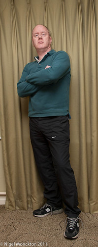
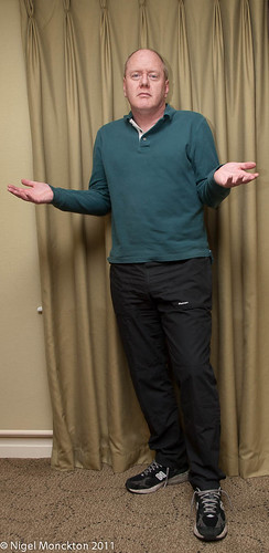
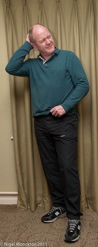
The left-most of these three is a very defensive stance. Typically it would signify an unwillingness to be involved or discomfort with a situation. The middle shot – a shrug – is a very open gesture. it suggests a lack of understanding, perhaps a willingness to compromise in an argument. In martial arts terms it is still a defensive pose – the weight on the back leg frees the front foot for a kick at an advancing opponent, and the hands are in forward positions ready to deflect a blow. The final shot suggests puzzlement – particularly the scratching of the head and the furled brow. The arm across the body also suggests non-engagement while the puzzle is resolved.
Finally moving to the front foot, hand position can be used to signify either aggression or friendliness. Note the front knee is still bent but the weight is much further forward than in the very first shot above.
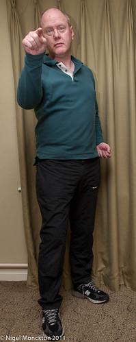

The relatively low camera angle reduces the threatening nature of the first pose somewhat – it would be even more extreme if the lead finger was jabbing into the ‘face’ of the viewer. Note also that the back hand is forming into a fist – a subconscious reaction to the choice of pose which emphasises its threat. the final shot is an almost worldwide gesture of welcome or greeting, which despite the similarity in body position gives a completely different sense – almost entirely on the basis of hand shape.
In terms of attractiveness, the second and third shots are the most effective with a relaxed subject in an easy pose. I suspect very few people would welcome a portrait session with any of the other poses as the primary output.
Friday, 1 April 2011
Photographing a family party–some reflections in the light of the course material
Lighting
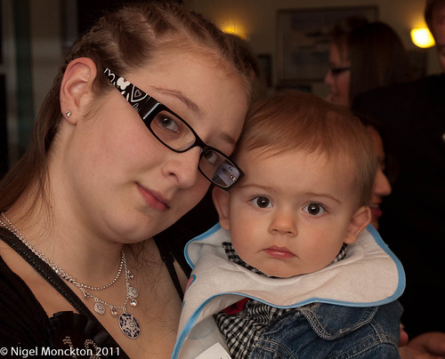
The party was in a small club/bar so lighting was very low, making flash essential. As the place had a low ceiling I chose to bounce the flash straight up. There is a small diffuser built into the flash that pulls out and flips over the light (it’s intended to help diffuse the light for wide angle shots). If it is not fully extended it protrudes from the top of the flash and helpfully reflects a bit of light forward. This works pretty well, but give the size of the room I was also able, in some areas, to fire the flash backwards over my head, so the subject was lit by reflection from the wall rather than the ceiling. The three different lighting effects can be seen in these photos:
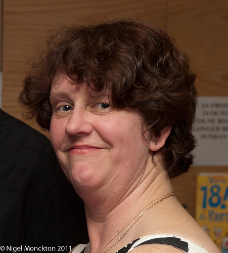
In the shot above the bounced light from the ceiling has given a broad overall light, while the protruding diffuser has reflected some light forward to fill the shadows. Careful inspection of the highlights in my sister-in-laws eyes show both the pool of light on the ceiling and the highlight from the diffuser.
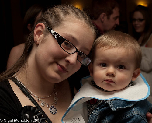
For reasons which elude me I didn’t use the diffuser/bounce in this shot, simply a vertical bounce from the ceiling which has resulted in deep shadows which take the edge off an otherwise pleasing shot. The following result, with flash bounced from the walls is much more pleasing, although it could perhaps be faulted for being a little flat
Eye contact
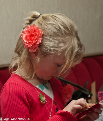
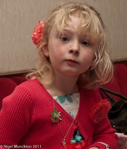
It was a party so people were expecting to be photographed – and even though most of the guests didn’t know me, it was clear that I was with the family. As a result getting eye contact with people was no problem – and given the amount going on it was also easy to get shots without. The two shots of my niece below clearly have very different feels to them, in spite of the fact that they were taken no more than a few seconds apart.
Expression and gesture
Similarly expression and hand gesture can change the meaning of a very similar overall pose in a matter of moments.
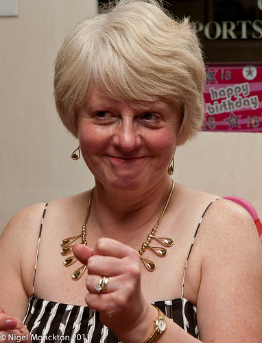
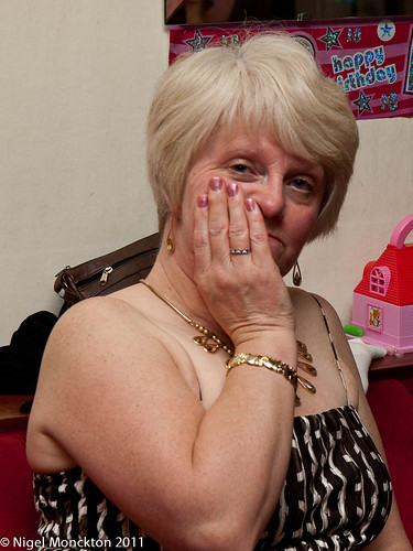
This pair in particular lend some weight to my growing feeling that you can tell essentially nothing about someone from a portrait beyond a rough estimate of age, health and possible social status (based on clothing and jewellery). My wife’s mood did not change significantly between these shots – albeit they were taken 15 minutes apart – and they provide no meaningful insight into her character – I just happened to luck out with the expressions. This is why I struggle with photographs such as Richard Avedon’s The Family which seem to be regarded as providing special insight into the rich and powerful. As far as I can see Avedon’s technique meant he could choose to take a photo that illustrated his particular agenda, and that any chance of objectivity is missing, so the photos probably say more about his agenda than they do the individuals.
I’ll finish on a slightly different tack with a couple of shots of one of my nephews.
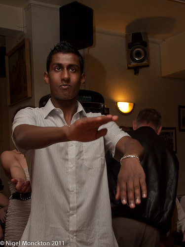
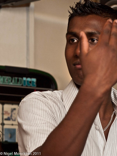
What is happening in the first shot? At first sight it looks like kung fu – the concentrating stare, the odd arm positions, but further investigation shows the arm of the young lady he was dancing with and some loud speakers, so a dance is a more likely outcome – actually it was the Macarena. The second shot is much more intense, and this is emphasised by the way the hand frames one of the eyes. Without the context it is much more difficult to work out what is happening, and I think it is a very effective portrait despite the fact that his hand obscures much of his face.
In summary
Most of the issues raised in this first module were encountered during the evening – even the impact of focal length (I just didn’t keep the odd distortions). Even in near spontaneous photography situations it pays to keep an eye on lighting, and given the vast number of opportunities my advice would be ‘keep pressing the shutter’. Tucked away among the standard shots there will be some really good ones.
