Sunday 31 July 2011

PnP Exercise 10: Moment and Gesture

One thing I have noticed is that the exercise in this part of the course seem to overlap quite a bit, so that shots that are taken for one exercise also seem to capture the spirit of another. So several of the shots discussed in this post are examples that could have been used to illustrate this exercise. Similarly, any of the shots here could also be considered for other exercises – perhaps the key is intent, although inevitably I think there’s a bit of luck involved as well. So the shots I include here were taken with this exercise in mind.

First up a shot where I had plenty of time to catch a ‘moment’, as one of the subjects was choosing postcards and the other is a model.
Bashful
The shorts belong to my wife – I’d never have the nerve for this shot with anyone else.

Next up is a shot I took in old Geneva. Hopefully the attraction is fairly obvious. I think the arrow on the road adds something to the photo, and I also like the way both the woman and the dog appear to be walking in step.

Woman and dog

Next up a shot from Interlaken. I saw this guy waiting outside the shop and thought he mirrored the models in the window nicely – was about to take when he obliged by moving his arms and legs into an even closer mimic. Sometimes you need a bit of luck!

P7101545.jpg

Conclusion

I think the key to getting this kind of shot is having time to ‘get your eye in’ and taking plenty of photos. All these shots were taken while my family was otherwise engaged so I was concentrating on the photography.

Friday 29 July 2011

PnP Exercise 12: Close and Involved

One exercise I never seem to have an opportunity to try out is this one – using a wide angle lens to get in amongst the action. Again, being a tourist gave me a chance to have a try in a relatively comfortable setting.

Close and involved can have different meanings. In this one for example I was no more than a couple of feet from my wife and daughter but the use of a 7mm lens has made them appear quite distant. It has involved the passenger on the adjacent seat, but as a shot it’s a bit unsatisfying, and the distortion is a little too obvious

On the train

So, if a couple of feet is too far, how close do we need? This next shot was taken in a crowded lift, by the simple expedient of lifting the camera above my head and pressing the shutter. Again the focal length was 7mm, but this time it has worked in my favour by reducing the need to ‘aim’ accurately.

In the lift - Jungfraujoch

For my money this is a more interesting shot – why is everyone looking in a different direction? (obvious if you know the context), what’s through the glass doors? (wall as it happens). I also like the way the gentleman on the left is staring into the camera. I’m not sure he knew he was in the shot, but his stare is a key focal point of the picture.

This one taken at 8mm is also quite interesting – and a quite different situation. I was stood at a railing, right next to the gentleman on the left, and I’m sure he was not aware that I was trying to include him in the picture. The view itself is not that interesting because of the cloud – I was trying to get a feel of ‘waiting for something to happen’.

P7091322.jpg

Shame he blinked!

The next shot is similar to the one in the lift – only this time it’s a cable car. There a bit more space, but people are engaged in the view – or simply hanging on – so again it is a comfortable situation. This time at 14mm.

P7111822.jpg

And finally, a shot which combines something of both the last two – again at 7 mm.

Going down - the cable car to Stechelberg

This seems to me the most successful of my attempts. I was within touching distance of the lady with sunglasses so it was definitely up close and involved, it was very definitely comfortable and the wide angle adds some context to the shot. For me it works.

Conclusions

Under normal circumstances there is no way I would consider photographing people with a wide angle lens – I would simply find it to intimidating. However, when there are lots of people crushed relatively closely together and people are expecting cameras it is relatively easy to take unobtrusive and hopefully interesting shots.

Tuesday 26 July 2011

PnP Exercises 9 and 11– Cours de Saint Pierre, Geneva

After a trip round the cathedral I had 15 minutes to myself in the square, so I popped on my 50-200 and did a few shots of people going about their daily business.

This group of ‘tourist angels’ caught my eye with their bright T-shirts

Tourist Angels, Geneva

On the opposite side of the square, and for the duration of my stay, these two rather more sophisticated ladies were chatting the afternoon away.

Chatting in the Cour de Saint Pierre

It was a gorgeously sunny day and this young lady’s parasol caught my eye. I particularly liked the halo effect which seemed kind of appropriate outside a cathedral. This is one example where being closer in and using a wider angle lens would have allowed me to change perspective and provide more context to highlight that particular thought process.

Walking in the sun

Conclusion

I found this a very comfortable situation. There were other people with cameras, there were enough people around to act as subjects and using a long lens meant I didn’t have to invade anyone’s privacy.

PnP On Holiday - Switzerland

Just been for a fortnight in Switzerland. As I’m struggling with momentum I decided to take the content pages of the course with me to remind me of the exercises in case I got the opportunity to take a few shots.

As it happens the exercises seem to have stuck – which is good news. In addition, under the cover of being a tourist I felt a lot more comfortable taking photos which included people. The next few notes will cover some of the course related shots I took on the hols.

Thursday 21 July 2011

Batiment des Arts Contemporain, Geneva

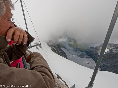
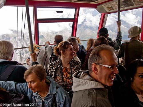
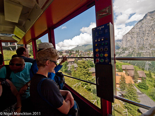
Been in Switzerland on holiday for two weeks. While in Geneva I took the chance to visit the Centre d’Art Contemporain, the Musée d’Art Moderne et Contemporain and the adjacent Centre de la Photographie , which between them had a couple of photo exhibitions as well as a couple of shows by other artists and a punk and minimalism exhibition from their archives.

The Idea of Africa (re-invented)

The Centre de la Photographie was hosting a curated exhibition featuring photography from Nigerian photographer J.D. ‘Okhai Ojeikere and the artistic collective ‘Invisible Borders’ who appear to be a mixed group of photogs and film-makers.

J.D. ‘Okhai Ojeikere  has some international renown for his fashion photography, in particular his interest in hairstyles, but these works were drawn from his private photography taken over the last 60 years documenting modern Lagos. The ‘Invisible Borders’ contribution was captured on a road trip from Lagos to Dakar and focussed on the ‘humiliations, bureaucracy, corruption and crime’ experienced when crossing Africa by land.

According to the press release which accompanied the exhibition ‘The Idea of Africa’ is a book by Congolese philosopher (V.Y. Mudimbe) which shows how the way we conceive Africa can be traced to Western colonial ideology. The (revisited) references the exhibitions attempt to to trace another history – one not framed on Western assumptions.

I’m afraid I struggled. With this introduction I was expecting something that would make me look again, perhaps even re-evaluate my perception of Africa.

Unfortunately, what I think I got was a selection of black and white photos from the urban documentary school. The press release talks of beauty – I saw concrete flyovers and brutalist office blocks mixed with urban poverty. I felt you could have achieved the same in some poorer areas of major British cities – so I’m not sure where the re-invention fits in. If anything it reinforced my - presumably Western colonialist – views of the consequences of the overlap of western commercialism and poverty.

This is not to say that taken on their own face value the photos were anything other than interesting and they were certainly beautifully printed. I’m just not convinced they were ever intended for the purpose that the curator has put them to.

Contraband – Taryn Simon

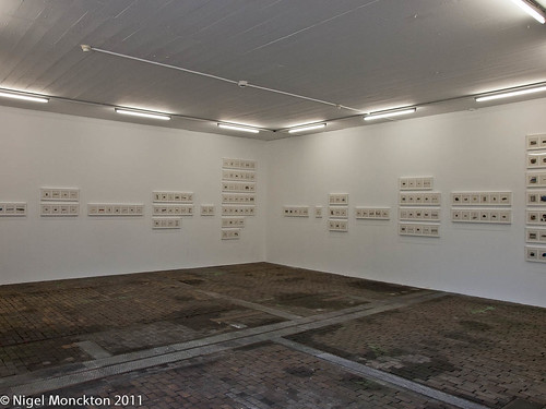
This exhibition – in the Centre  d’Art Contemporain – was the first solo exhibition by Taryn Simon in Switzerland. It featured 546 photos from a set of 1,075 photos of items detained or seized from passengers and overseas mail over a 5-day period at JFK Airport Terminal 4. All the items were classified as prohibited, undeclared, etc.

The press release makes an issue of Simon’s scientific methodology – which falls under the category of ‘trying too hard’, as far as I’m concerned. Each photo was captured, we are told, using ‘a labour-intensive forensic photographic procedure - large format camera and the same neutral backdrop for all items.’ This is ‘reinforced’ by presenting the series alphabetically from ‘alcohol’ to ‘wood carvings’.

As it happens they were hung in batches which could be viewed in several different orders and they were reproduced at about A5 so the point of all this escapes me. They certainly benefitted from being grouped under headings though, because many of the items were not easily identifiable.

Centre de la Photographie, Geneva

Irrespective of my issues with the ‘science’, they were a fascinating set of images. I doubt a much smaller group would have had the same impact, but the sheer number and variety of items was memorable in itself. There are some samples on Taryn Simon’s website. People smuggle or carry odd things. In between the obvious – viagra, heroin, gold-dust, counterfeit handbags etc – there was dried deer penis, dried guinea pigs, cow dung toothpaste and horsemeat sausages. It was difficult to decide whether to be appalled or amused.

The work itself fits with some of Simon’s previous work which seeks to document unknown parts of daily life in America. Should you ever wonder what customs officials are handling every day this exhibition would be a good place to start.

In the press release Simon is quoted as saying that she was interested not just in the cataloguing, but also the ability of the photos to transcend boundaries –the goods were denied entry but have made it across the border as images. An interesting idea – especially as they have now been re-exported to Switzerland! I can see her point though – without the photos the objects would float in international limbo until they were destroyed and most of us would be none the wiser.

Taryn Simon currently has an exhibition at the Tate Modern in London. A rail trip is tempting.

Sunday 3 July 2011

Exercise 18: How space changes with light – interior spaces

As my previous stab at this exercise was about exterior space I thought I have a look at interiors as well.

because of the orientation of our house we have two rooms that get bright sunlight at opposite ends of the day so I thought they’d make a useful case study. All the shots in this groups have been prepared by blending 5 shots in Picturenaut HDR software

First up then – one of the front room and the dining room at around the same time – 09:30 in the morning.

Sunday morning.jpg   Sunday morning dining.jpg

As we can see the front room gets oodles of direct sunlight – there are strong and dramatic shadows and there is the possibility that it may even be a little too well lit. The dining room on the other hand is receiving no direct light – although the garden outside the window is in bright sunshine – the overall effect is a little dark and unwelcoming at this time of the day.

At the other end of the day the situation is completely reversed as these two at 19:45-ish show.

playroom late evening.jpg   Dining room early.jpg

The front room is still nicely lit – the benefit of a bay window – and seems somehow more relaxing than earlier in the day. The dining room now has dappled sunlight pouring through the patio window and is transformed into a location for a cheerful lunch ort family dinner. The warm colours in the room complement the warming colour of evening sunlight.

Unsurprisingly there are variations on this theme at other times during the day. This shot of the front room was taken around 11:30 in the morning The brightness of the sun is easing as it moves around to the right and the room is more relaxing than the first shot above.

playroom late morning.jpg

As the evening progresses the dining room receives more direct light as the sun clears the trees which are providing the dappling to the shade and as the sun is correspondingly lower in the sky the shadows are longer and the room develops a real summer evening feel. (This shot at 20:40)

Dining room.jpg

Just an hour later and the sun is almost set (it would have been completely gone if I’d waited 5 more minutes) and their is no direct sunlight in the room. The room is starting to revert to the flat lighting of the morning shot.

Dining room later.jpg

Conclusions

Choice of timing can make a significant difference to the feel of a room – probably more so than I observed in the exterior shots at the Tortworth Court. For example, if you were doing an interior shoot of the dining room, and were relying on a table setting as the centrepiece, you would probably choose afternoon/evening, or have to add artificial light to liven the room up

Exercise 19: Odds and ends

Solway sands by nmonckton
Solway sands a photo by nmonckton on Flickr.
Another 'single figure small' taken from the Upper Promenade at Maryport. Similar in content and execution to a previous shot for this exercise (man and dog with golden sunset) it is very different in feel from that shot as a result of the different lighting conditions.

I deliberately cut off the horizon so that there was no sense of scale beyond that given by the figure - I think this adds an essence of surprise to the shot.

Saturday 2 July 2011

Exercise 18 – Changing composition to make better use of the lighting

This shot was taken in the same lighting as the last shot in my previous exercise 18 post – in fact just 10 minutes later.
1000/473
I was after a shot which captured something of the spirit of the building in spite of the subdued lighting, and this ‘found’ arrangement on one of the patio tables seemed to do the trick. The subdued lighting means that the exposure for the white crocks is relatively easy, and there are no deep shadows to contend with on the building behind.
A couple of my shots in the previous exercise were taken with the light behind the building – this one in particular. By moving round to the same side of the building as the light, and taking a position where the effect of side-lighting down the building adds some interest makes this shot – again taken only 10 minutes later – a distinct improvement.
Tortworth 18:6
This next shot is a bit of a cheat as it was taken several months prior to the one above. However, the sun was in a very similar position relative to the building – although a little lower in the sky – so I think the comparison is justified. I have chosen a position away from the building so that it is seen in the context of its formal gardens. The side lighting this time adds interest to both the house and the topiary.
Tortworth 18:9
And finally for this building another shot from the archive which makes rather more dramatic use of the floodlighting – the time variation is to all intents and purposes irrelevant as the lighting is constant whenever the floods are on.
Tortworth 18:10
This is not quite as sharp as I would have liked, and the vertical converge a bit unhelpfully, but as it was hand-held with a standard zoom I am reasonably pleased with the outcome. A tripod and a wider angle lens cold perhaps have dome the scene a little more justice, but it serves to illustrate the point that there is more than one way to capture the drama of the building given any particular set of lighting conditions.
Conclusions