Tuesday 27 September 2011

The Hare With Amber Eyes – Edmund de Waal

Currently reading the above book, and although I haven’t got very far into it yet there are a couple of quotes I wanted to record which seem pertinent to photography – even if they don’t directly relate. If I come across any more I’ll be adding them to this post.

This first is fairly obvious:

“House-watching is an art. You have to develop a way of seeing how a building sits in its landscape or streetscape. You have to discover how much room it takes up in the world, how much of the world it displaces.”

The next is less obvious, but feels to me to have parallels with taking/making a photo:

“But the vitrine – as opposed to the museum’s case – is for opening. And that opening glass door and the moment of looking, then choosing, an then reaching in and then picking up is a moment of seduction, an encounter between a hand and an object that is electric.”

Saturday 17 September 2011

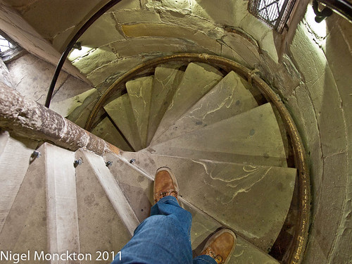
PnP Ex. 17: Users View: Spiral Staircase, Warwick Castle

I find this a fascinating topic - can't really understand why I've never tried this viewpoint idea before.

This is self-explanatory - its a spiral staircase inside a traditional castle tower. I've tried, by shooting straight down, to capture some sense of the steepness and slightly dizzying effect of descending this type of stairwell.

Some sketches for Assignment 3

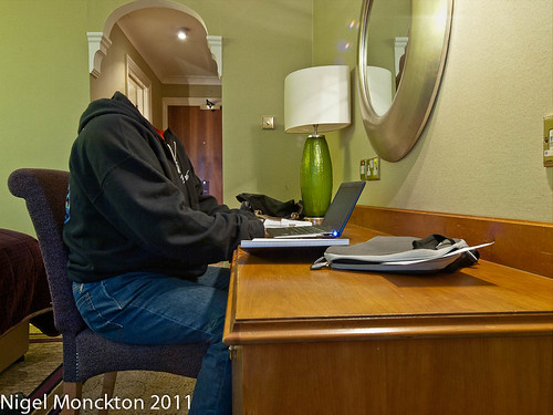
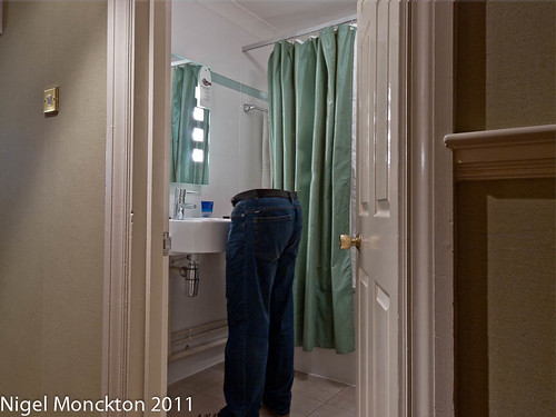
These have been up on Flickr for a few days now and attracted, for my shots at least, a fair bit of interest. In reality I intended them as trial shots to work out the issues with my proposed technique for invisibility – which is to photograph the same scene twice (or more) from the same camera position with and without a person as the subject, overlay one on the other in PSE and then erase the flesh parts.

This is my first attempt and technically it works OK. However in this version there is the rather odd optical effect that makes it look as though my head has been replaced by the head of a large and partially transparent bird. This is rather surreal and a lucky accident that make the picture rather more interesting in its own right. Unfortunately I feel it distracts from the overall purpose of the picture.

1000/553: 07 Sept 2011: The Invisible Man works late

This next shot, taken the same evening is rather closer to the ideal, in that it does not have the distraction of an optical illusion. A slightly lower angle to show the bottom of the trouser legs might have been useful, but this is close to what I am hoping to achieve.

The Invisible Man cleans his teeth

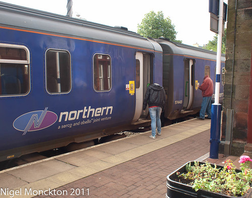
Setting these things up in the controlled environment of my own hotel room is one thing, but to make it work as a theme I need to be able to do this in other, less controlled situations. The next two shots, in my local railway station show that this is achievable – these were complete without the use of a tripod – which is not ideal – and slightly realigned using PSE.

Visiting the station with the Invisible Girl1000/557: 11 Sept 2011: The Invisible Girl reads a timetable

These two also work well from a technical viewpoint so I think the idea works technically.

Other issues

In looking at the comments on Flickr and thinking this through in my own mind I’m still undecided as to how invisible the people are. My initial thoughts are that they should not be invisible when interacting with other people, as at that point they are not isolated, but I’m still unsure in my own mind whether they should be visible in reflections.

Sunday 11 September 2011

Feedback for assignment 2 and thoughts on assignment 3

Well I got my feedback for Assignment 2, and by and large it was very positive. However it is fair to say that most of the comments were about technical aspects of the photography, such as the need to use Shutter Priority as a way to control movement blur, and my ability to handhold at low shutter speeds.

I have no beef with any of this – for example, SP is a tool I’ve never got to grips with – but I can’t help the suspicion that the reason the comments are about technical issues is that maybe I wasn’t terribly creative or imaginative in the assignment itself. This coincides with the assessment feedback I received for DPP and has been bothering me for a while.

The most successful assignment in DPP was the one where the photos were about something that meant something to me – i.e. the hotel room shots – the secret is channelling that into the photographs, interpreting the briefs less literally and trying to say something interesting.

I did hint at that in my assignment 2 submission, suggesting that the story behind the folk singers/dancers/flag-wavers might make an interesting project in it’s own right.

So – Assignment 3. At face value it’s about taking some photos which demonstrate the function of several buildings – easy enough – but what else to say. Perhaps some sense of how it feels to use the buildings for their intended purpose?

Apart from my own home the buildings I know best are hotels, so I’m going to start there. It’s probably a sad reflection of my life but motorway service stations are pretty familiar as well. And what do I feel when I’m in them – generally isolation or invisibility. Invisibility is easy with a bit of post-processing work so, taking my cue from Cindy Sherman and Latham’s Cyrus character, I’m going to develop the Invisible Man as an alter ego for this assignment. It seems likely though that in some cases using myself for the images is going to be a little tricky so there will probably be some invisible friends or family members helping me out

PnP Exercise 16: Exploring Function (ii)

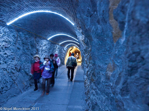
Junfraujoch is a railway station/tourist attraction high up in the Alps between Monch and Jungfrau. Much of it is built inside the mountain, and it seemed to offer a number of opportunities for exploring the function of man-made structures.I considered using the railway station itself, but this felt a little ordinary – it’s location underground having little influence on its function. Similarly the various exhibitions and the ice sculpture display did not really seem to me to offer anything that I could not have found elsewhere.

The essence of the construction for me, apart from it’s height in the Alps, is the fact that most of it is underground and largely intended to move tourists from the station onto the mountains – which lead me to the idea of trying to capture a tunnel and the purpose of a tunnel.

Tunnel, Jungfraujoch

I like this composition for a number of reasons:

  • there is, quite literally, light at the end of the tunnel which leads your eye in the direction of travel
  • the converging lines on the floor and the diminishing scale of the blue lighting also lead your eye through the tunnel
  • I considered cropping the mass of rock on the right, but left it in because I feel it gives a sense of the solidity of the surroundings.
  • there is enough blur in the people to provide a sense of movement. Perhaps a little more blur in the people would have conveyed a greater sense of movement – but I would have had problems getting  the rest acceptably sharp given I was already hand-holding at 1/6:f/2.8:ISO1600.

Final thoughts

Initially I started this exercise intending to capture the function of the Junfraujoch complex, but I felt this was too much to ask of one shot. Instead I opted for a simpler approach – capturing the function of one part of it. In this way this pass at the exercise was perhaps easier than castle Unspunnen – but on the other hand I had considerably less photographic material to work with. Overall I’m satisfied with the shot.

The exercise itself has emphasised the importance of having an idea of what you want to capture and why before you press the shutter. Sometimes this will be obvious, sometimes it will take more thought, but in the two cases of posted here I’ve taken shots I would probably not have considered without that discipline.

Finally I think the comparison of this tunnel shot with the Castle Unspunnen shot shows the value of including people when demonstrating function. While the castle shot clearly gives an impression of strength and some impression of a dominant position, the reasons for those attributes is not clear whereas the actual purpose of the tunnel is much more obvious. A little of this may be due to the relatively simplicity of the concept for the tunnel but overall I hink the epople are the key difference.

Wednesday 7 September 2011

PnP Exercise 16: Exploring Function

This is the one exercise from this section I’ve yet to try – largely I think because I’m fairly spontaneous when it comes to photos and this one requires planning. Took a whole sheaf of photos while on holiday to illustrate this exercise but in truth most of them missed what, to me, seems like the point of the exercise – the pre-planning.

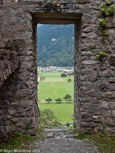
Happily there are a couple of exceptions – first up being this shot of Unspunnen Castle, near Interlaken.

Schloss Unspunnen, Interlaken

Although I know little about the formal history of this castle I had visited it before so knew what to expect. I also have some background knowledge on castles and their purpose.

This particular sample is situated on a hill overlooking the flat land around Interlaken – i.e. it is intended to dominate, provide a convenient military outlook post and by dint of its construction and site be hard to attack.

An ideal shot would show the strength of construction, emphasise its dominant position and give some idea of its separation from its surroundings. Initially I looked for an example of a crenulated wall, but there were none that offered an opportunity to demonstrate other aspects of the site – not least because there were some quite large trees around the site that were presumably not there when the castle was built.

This doorway seemed the best opportunity – it is clearly of very heavy construction and the view through the door is both far-reaching and indicates the elevated position. While there is relatively little context I think most people would recognise this as a castle – or a castle ruin.

Second example will be in my next post.

Tuesday 6 September 2011

Swedish Wildlife Photographer of the Year Admits to Faking Photos

Sad. I'm sure he's actually a great photographer - so why did he do it?

Swedish Wildlife Photographer of the Year Admits to Faking Photos:

'via Blog this'

Steve McCurry: A Retrospective on Vimeo

Leading on from my previous post this would seem to confirm that documentary photography is the natural home for 'People and Place'. This selection contains some stunning portraits as well.

Steve McCurry: A Retrospective from leica camera on Vimeo.

Thursday 1 September 2011

Non-architectural photography of buildings/man-made spaces

The course notes observe that this “is not considered a genre in most photographic writing” and suggests that I will need to search in areas away from traditional architecture outlets to find examples. So I thought I’d give it a try, and to my surprise found that photos that reasonably fall into this category are in fairly short supply.

A flick through a couple of recent back issues of the BJP turned up nothing of note – ditto the Family of Man catalogue that I’ve recently acquired.

No problem I thought – I’ll try the Wanderlust Travel Photo of the Year Vol.4 – the cover photo of a Sikh meditating before the golden temple was promising, but in truth that was very nearly it. Very few other photos fitted with the idea of people interacting with space, a notable exception being: Coffee shop, Madurai, India | Wanderlust Photo of the Year 2007 - People section | Wanderlust which admirably caught the hustle and bustle of an Indian coffee bar.

Travel Photographer of the year – Journey Three offered a few more examples: shots by Karoki Lewis and Larry Louie being notable examples. Cat Vinton’s award winning series of a family dismantling and packing away a yurt is also worth seeing.

In truth however ‘interaction with place’ was in relatively short supply in books which I’d expected to feature it quite strongly. Perhaps travel photography is conventionally about ‘People’ or ‘Place’ rather than ‘People and Place’, but that does feel rather at odds with my perception of its aim.

Given the observation above about this kind of photography not being regarded as a genre the next place I went was a couple of ‘instruction’ books in my collection – Tom Ang’s Digital Photographers Handbook and Advanced Photography by John Hedgecoe. Both contain lots of pictures of ‘place’ and lots of pictures of ‘people’, but in the latter case they tend to be interacting with each other or an object – rather than there being any sense of interaction with their surroundings.

Oddly, Ang has sections on buildings and urban views and only one of the pictures features a person – surely the essence of urbanness is the population density. The documentary section has a rather nice shot of a charcoal maker (I assume) but the rest are shots of people looking at the camera (is this really documentary?). There are also one or two other examples dotted through the book, but given that it has 400 pages this book reflects the notion that people and place is not a recognised genre.

The Hedgecoe book does rather better – with sections called ‘People in Context’, ‘The Photo Interview’ and even the ‘On location’ section features people interacting with place. There is a rather nice picture of sculptor Henry Moore at work in his studio as well – in a section on camera movements. So perhaps there is a hint here of a genre – but no more than that.

Finally, as a complete contrast I thought I’d try Don McCullin, and it seems to be in documentary photography that ‘People and Place ‘ comes into its own – assuming this is representative. On reflection this is perhaps obvious – while the book contains some stunning people photos, they would be considerably less effective as documentary without some context. The Homeless, 1969 and Derry, 1971 are especially good examples  I couldn’t find either online although there is a short film that catches the spirit of, and some of the shots from, The Homeless on the BBC website.

For me the stand-out image in this context is Christian Gunmen in the Foyer of the Holiday Inn, Beiruit, 1976 which seems to encapsulate the idea of people and place, but in a way which challenges our perception. We have a clear idea of place – it’s a grand hotel, but it’s a mess - then we see the masked gunmen, using the building as shelter – in a weird perversion of the original intent of the building and a final touch of madness – there is a cardboard cut-out of a hostess behind the information desk (the punctum perhaps)

Final thoughts

It’s difficult to disagree with the opening idea that there is no genre of photography (perhaps not even a sub-genre) that captures the concept of People and Place. Travel competitions – which are perhaps a representation of the photography most of us do – tends to concentrate on one or the other, On the, albeit limited, evidence I’ve seen photo instruction books and magazines tend to gloss over it in the context of some other photographic activity.

There are very few examples of photography which seems intended to explain the space – even the McCullin shots are about the humans using the space, rather than the space being used. I’m not clear why this is – perhaps I’m looking in the wrong place and location advertising is the place to look, but even here I suspect the advertisers will not want to give the impression that the place is crowded. Maybe there’s the germ of an idea for a different kind of photography book here.