Thursday 28 June 2012

Two-lane Blacktop

Posting this here because it has emerged from the shots I’ve been taking during the later stages of this course, although in reality I’m hoping to develop the idea as I move through Landscape. Roads are a reality in all our lives, but doing 30,000 miles a year means they feature in mine quite a bit more than the average so I guess, as with hotels, that it’s inevitable I should want to photograph them.

If you travel them enough, roads, even parts of roads, seem to develop personalities – this is a good bit to drive, this bit is just tedious - and you start to develop a relationship with them. The relationship is even closer at night when the countryside is essentially invisible and even the towns seem otherworldly and distant from your car/road bubble. Turn the radio off and the only company is engine/wheel noise and the flashing white lines just head off hypnotically into the distance – it’s a bit of a cliché, but it’s just you, the road and the night. I like walking in the dark for much the same reason – the loneliness and the sense of being inextricably linked with the road or path.

So, whether I can weave it into Landscape or not, this set is going to be developing over the next few months and we’ll see where this particular road trip takes me.

Wednesday 27 June 2012

Into the dark: A history of night photography - British Journal of Photography

Into the dark: A history of night photography - British Journal of Photography:

'via Blog this'

The May 2012 edition of BJP had the theme of night photography so - given my interest in what they humorously call the 'Dark Arts' - I was more than usually keen to get the wrapper of this particular edition. Inside however I found a bit of a mixed bag - summed up for me by the irony of running a review of two cameras which have sufficiently high ISO capabilities that you can photograph in dark situations as if it were daylight.

A significant proportion of the photos and sets seemed to be about defeating darkness, rather than using its creative potential - one set even used 'artificial' darkness - overpowering daylight by the use of flash lighting. I'm not trying to say that some of these shots did not have merit in their own rights - but I'm not sure they live up to the promise of the headline. James Nizam's Thought Forms set is a case in point - they are extremely clever, well executed and quite thought provoking, but they are more about light than they are about dark.

I was less clear about the merits of the shots which 'reveal' secret military exercises and missile launches. Quite what I'm supposed to make of the revelation that the American military practises night fighting in the dark eludes me.

On the flip side the set by Bill Henson seem to me to catch the essence of night with his dark, murky dream worlds hinting at unseen terrors  - touching on some of our primal concerns, and maybe fantasies, about darkness. Miti Ruangkritya's portfolio of flood shots in Bangkok were given added mystery and poignancy by the dark, and the photographs of Inuit people by Donald Weber using the characteristic light of an LCD screen was a clever take on the challenges facing a people who have moved from the stone age to the digital age in a single generation.

So overall - the usual BJP mix of stunning photos, clever ideas and stuff which I don't get (yet - if ever). Plenty of food for thought though, and it  makes me wish for the earlier night-falls again (sorry).

Friday 22 June 2012

Takehiko Nakafuji "Night Crawler" 1995

Takehiko Nakafuji "Night Crawler" 1995:

'via Blog this'

With apologies to anyone who isn’t on Facebook, but this was the best link I could find for a selection from Nakafuji’s Night Crawler, which I discovered in the May 2012 issue of BJP. There is a somewhat smaller but more accessible selection here.

It jumped out at me for its resemblance to Daido Moriyama, in that they are night shots in grainy high-contrast black and white, so it was no surprise to find the Nakafuji had studied under him. Night Crawler 1995/2010 is about Tokyo at night and concentrates on the differences between the ‘95 set and the later set. Sadly, it’s rather difficult to make head or tail of these differences in the rather limited viewing circumstances offered by Facebook and the other galleries. However I find the individual photos themselves very striking (not least I suspect because of the stylistic similarity to some of the stuff I’m currently producing).

The lead example in the BJP article is a case in point:


The overall image is dominated by the contrast between the very deep blacks of the shadows and the strangely luminous – almost ghostly – face of the girl under the umbrella. Incidentally, it is placed almost dead centre in the photo, which is contrary to conventional wisdom, but serves to draw even more attention to it. She seems to be huddled against the cold or even hoping to pass by un-noticed – I can’t help wondering what is happening just out of shot. The tilt of the picture also adds to the tension, as does the hint of activity in the background. It’s unclear if the intense white around the girl is a result of the lighting or has been added in the darkroom, but it does add to the shot by hgelping to isolate her from the surrounding shadow. One final thing that stands out to me (punctum perhaps) is the size of her shoes, which seem surprisingly large.

The article does not mention why Nakafuji uses the high contrast treatment, but I’d be interested in his take on this as it might help me understand my own interest in the style. One thing the set does make clear though is that it can be used quite effectively in people pictures – something I’m just starting to experiment with.

Tuesday 19 June 2012

Loose ends (iii): Just sitting

Another loose end from my list is that on reviewing this blog I found I hadn’t completed Exercise 8:Varying Pose. Continuing with the rather literal and un-creative self-portrait theme I adopted some 18 months ago feels a little like a tick box exercise at this stage, so I felt it would be more instructive to consider some photos I took during the course of this module in the light of my current understanding of the exercise.

I’m going to start with this pair of photos – taken 20 seconds apart – in York during the early stages of the module.

P4105338.jpg  P4105339.jpg

I especially like this pair because they show that relatively small changes in a pose can reveal quite different things. In the first the woman is clearly talking. From the upright posture of her head and the position of her arm it seems likely that she is being quite animated – yet by the simple expedient of leaning slightly forward, moving her arm to her neck and tilting her head to one side she becomes an attentive listener in the second shot (about 20 secs later). This variation in interpretation is achieved without any recourse to her eyes – which remain hidden in both – and is a good example of the power of pose to affect our reaction to a portrait.

This next shot is another example of the importance of head position in interpreting a sitting pose. This pianist, with his arms forward on his instrument and his head tilted to look at the keys is very clearly concentrating on his music and appears oblivious to the little girl watching at the end of his piano. A more raised head position would have suggested a greater awareness of his surroundings, perhaps even suggesting that he was not actually playing at the time of the shot – unlike in this version.

P4105368.jpg

This final shot is of a group of people sitting listening to a brass band concert and I include it here for the variety of seated poses and their impact on our view of the individuals pictured.

E5070303.jpg

The two gentlemen in the centre are sitting in very formal poses, and seem to be taking listening quite seriously – particularly the one on the left who appears to be craning his neck slightly. By contrast the three people on the left hand seat are very clearly relaxed as indicated by the more slouched position and their leg positions as well – indeed the only way the gent on the far left could appear more relaxed would be by putting his hands behind his head. In another take on a simple sitting position the girl on the right is quite upright, but the twist in her body suggests that she is really paying attention to the child in the buggy rather than the band. So, in one shot, in which the subjects are all in essentially the same pose, the slight nuances in limb and body position provide a whole range of clues about activity and intent which we are free to interpret on the basis of our experience.

It is only a short step from here to deliberately using this sort of variation to allow interpretations of a more formal portrait sitting.

Sunday 17 June 2012

A few loose ends (ii)

This particular loose end refers to Exercise 18: How space changes with light.

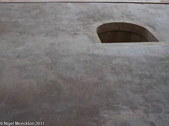
I took the pair of shots below on our summer holiday – from the same seat at an outdoor restaurant table in Geneva. They are taken slightly over an hour apart – both on auto white balance, which may have some impact as the colour temperatures are a little difference – and clearly show the impact that changing light can have on the perception of a ‘scene’. In truth ‘scene’ is rather overstating the case for a concrete rendered wall with a hole in it, which to my mind makes it all the more notable that the first appears cold, soulless and drab, and the second, taken just an hour later, seems to speak of warm summer evenings and makes me want to know what’s happening inside.

Restaurant l'Armature, Vielle Ville, Geneva Restaurant l'Armature, Vielle Ville, Geneva

There is no direct light in either picture so the difference is entirely down to the colour temperature of the light.

Ralph Gibson - Master Fine Art Photographer - YouTube


'via Blog this'
Ralph Gibson - Master Fine Art Photographer - YouTube:

This video is well worth watching for Gibson's explanation of his background and interest in black and white photography. The following is also worth a look  as he is not only a very good photographer but a competent guitarist as well. This would fit with his thoughts about needing to be 'cultured' - have an understanding of literature, music, poetry - in order to keep finding inspiration.

Saturday 16 June 2012

A few loose ends (i)

Have been reviewing my Flickr collection for this module and have spotted a few examples of shots I took with the an exercise in mind which I subsequently didn’t use or comment on. As they clearly felt worthwhile at the time I thought I would do them some justice and post them here.

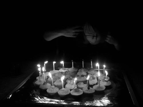
One thing I have learned in the course of this module is the joys of black and white, and in particular how well it works (for me at least) when dealing with shots in extremely low lighting conditions, allowing te creation of very definite moods. In truth any number of these might be used to develop the ideas of Exercise 3: Experimenting with Light – the shot of my wife in the Northumbria set, for example – but for this post I wanted to show another candle-lit shot, taken on my daughters 17th birthday and uploaded to Flickr back in the March of this year.

1000/742: 02 Mar 2012: Happy Birthday Naomi

The original was already quite dark and after conversion to black and white I lit the face a little more by brightening the orange/yellow channels and deepened the blacks further to produce this version. As I noted when I posted it originally this creates a ghostly effect which seems to hint at the memories of childhood slowly fading.

Tuesday 12 June 2012

A Northumberland weekend – part (ii)

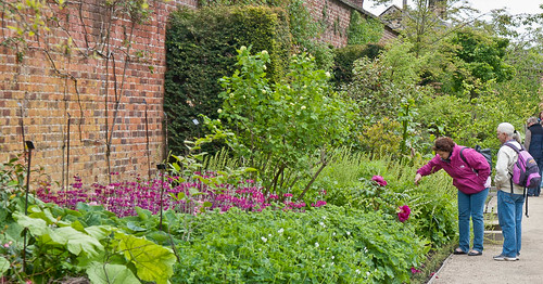
Just a couple more shots from the weekend which seemed to draw on individual aspects of the course material. First up is ‘a comfortable situation’. Alnwick Castle has some magnificent gardens – chock full of people doing touristy things  - like taking photos – so a little bit of candid photography was easy. In this first one I was taken by the match between the colours of the flowers and the lady’s cagoule.

Colour co-ordinated

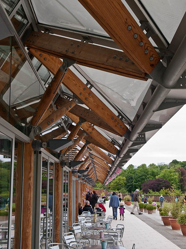
In the second I was drawn by the fairly striking architecture of the tea-room, but felt it was a bit sterile without people (figures as accent) so I tried this angle which aims to capture both the architecture, its scale and, to a lesser degree, its function.

Alnwick Castle Tea-room

To finish with - pictures of my wife, my daughter and myself drawing on various aspects of ‘people unaware’. First up my daughter:

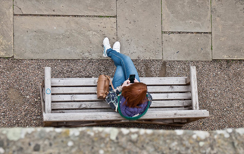
Looking down

Then my wife. The location is a tent and the light source is three candles on a tray.

Reading by candle-light

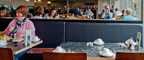
Finally, me, in a fish and chip restaurant. And for the record after my last post – this shot was definitely fun.

Fish and chip restaurant

A Northumberland weekend

Spent a few days in Northumberland over the Jubilee Bank Holiday weekend. Didn’t take quite as many photos as I expected – not quite sure why – but there is something about this course in the reasons. Can’t quite put my finger on it but it feels that many of the the things I used to shoot are losing interest for me – I don’t have the urge to shoot flowers and pretty landscapes at present, and I keep asking myself, “What am I trying to say with this shot?” and if I can’t think of an answer I don’t press the shutter. While that may be good in some ways – who needs a hard drive full of pictures of buttercups – a part of me worries that in striving to make my photography ‘better’ (whatever that means) I may be losing some of the fun. Our visit to Lindisfarne typifies the experience. Previously I would have come back with 50-60 shots – mainly of obscure stonework – whereas this time – if we ignore bracketing the total is about 8!! Perhaps the answer is that the fun was in pressing the shutter and collecting.

Anyway, I appear to have substituted trying to take something more meaningful for simply amassing a huge number of shots to ‘prove’ (to whom?) that I’m a keen photographer. Sometimes this is fun, sometimes it isn’t. I’m guessing the secret is working out how to make the meaningful stuff fun on a more regular basis – I’m also guessing that when the meaningful stuff is not fun, it’s probably less meaningful.

Anyway – enough theorising – time for some photos. First up Lindisfarne – and only two shots that I thought were worth showing.

The first is an attempt to catch the historic image that the tourist brochures harp on about. The two kids on the wall caught my eye at about the same time as the view of the castle beyond the abbey.

Lindisfarne

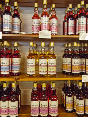
The second shot – which I’ve already posted on my photo-a-day blog – catches more of what I felt about the place. Forget the beauty,  forget the spirituality – it struck me as a giant celtic themed gift shop – not so much spirituality as spirits.

1000/837: 05 June 2012; Lindisfarne

Not quite sure how to tag this post – not even sure it belongs in this course, other than that I have tried to capture my sense of the place at the time I visited it.

Monday 11 June 2012

Photo anthologies

Not sure anthology is the right word, but I’m talking about collections of photos from a variety of photographers. I have three of these so thought I’d do a mini-review of each as a single post.

World Photography: Ed. Bryn Campbell 1981

This is an excellent collection if you can lay your hands on a copy (there are several on Amazon). It has a dozen photo portfolio from each of 25 of the biggest names in photography – Erwitt, Friedlander, Cartier-Bresson, Bailey, Meyerowitz, Brandt etc. together with an extensive essay featuring the works of a further couple of dozen.

The print quality, particularly for the black and whites, is excellent, and the size of the pages means that the photos are reproduced at a decent size. Plenty of highlights in a collection this big, but favourites include Erwitt’s dog photos, Burt Glinn’s photos of Japan and Brassai’s Paris photos.

Some of the photos are hard to look at – McCullin’s war photos are the most obvious example, but there are similar scattered through the book. In contrast some are just delightful – Hamaya’s photo of Japanese kids walking through the snow in straw snow coats is perhaps my favourite in the whole book although Cartier-Bresson’s little boy with a large bottle of wine in each arm runs it a close second.

Masters of Photography: Ed. Reuel Golden 2008

A much smaller book than the previous one although picture quality is still pretty good. This one contains small portfolios (4-6 photos each) representing around 50 rather more contemporary, but still ‘classic’ photographers, together with some short biographical notes. A few of the pictures are spoiled by being printed over two pages, but the book does contain some almost iconic images – Moonrise over Hernandez (Adams), some shots from Steve McCurry’s Monsoon series, and Migrant Mother (Lange) being obvious examples. The downside of books of this type is that you get very little feel for an overall style from the photographers, but that is set against the sheer range of material on display. I doubt I’d have come across the work of Bert Hardy without it for example, and Nick Knight’s ‘Susie Smoking’ was completely new to me, but is now one of my favourite photos.

The range of artists and the tie period covered also throws up some interesting contrasts and comparisons – for example the street photography of Doisneau or Atget  and Martin Parr, or the rather tawdry-feeling implicit sexuality of some Nan Goldin material with the rather glossy, sanitised Helmut Newton version. These kind of comparisons abound and make the book worth regular visits. It’s also quite a source of inspiration and ideas for development, or simply for playing with.

Art Photography Now: Susan Bright (Revised and Expanded 2011)

According to the blurb this book presents the work of 80 of the ‘most important and best loved artist-photographers in the world today’. Unlike the two above it is divided by broad subject area rather than photographer, and there is very little overlap in terms of photographers with those books – Sherman, Goldin and Gursky being the most obvious exceptions. The portraiture section is big on the ‘snap-shot’ ethic of modern practice – not intended as a denigration – merely a description. Tina Barney’s work is an excellent example of the contradiction this poses – with the work apparently being captured on a large format (4x5) camera, while retaining the feel of genuine family photos. The introduction to the Landscape section makes the following observation which had not really occurred to me before: “The complexities of landscape, which can at first seem the most straightforward of artistic genres, are not to be underestimated…..landscape photography offers the space to explore ever-present artistic and philosophical concerns about our place in the worlds.” The Gursky and Misrach examples provided are to my mind classic cases of those concerns. I was also taken by the New Opposition series from Doug Aitken – something to explore in Landscape 2.

There were further sections on Object, Narrative, Document, FAshion, City and Transitions, all of which are worth exploring – although I’ve concentrated here on the two sections which seemed to have most relevance for this module.

Summary

It’s clearly difficult to do real justice to the work of any photographer in no more than a dozen shots, and no matter how good the reproduction it is not always possible to get the true impact of an image in book format (Holdsworth’s Iceland shots in Art photography Now are a good case in point). However, if, like me, you live in a relatively remote country area where a visit to a gallery is a full day’s outing, this type of collection is something of a life-line, as valuable as tracking down a photographers website, and one of the few ways to get a reasonably structured insight into the relationship between photographers and their practises.

Assessment in the post

Title says it all – everything I can think of has now gone off for the July assessment.