This blog forms the learning log for my OCA photography degree module Photography 1: People and Place. My learning logs for other modules and my personal photo-a-day blog can be found through the tabs below.
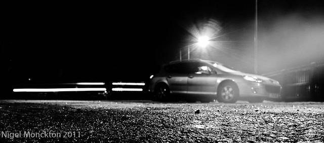
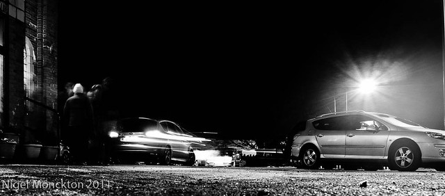
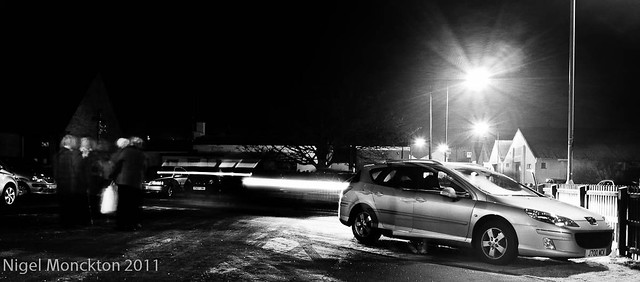
I'm quite intrigued by low viewpoints and the panoramic format - somehow it seems to provide a different view on the world - in this instance almost voyeuristic, or perhaps as a spy. This set was taken by simply placing the camera on the floor by my rear car wheel - a technique which raised a few eyebrows among the congregation as they were leaving. The mist to the right of the shots is simply the exhaust from the car. I tried to balance the shutter speed to allow blur on the lights of the moving cars, while not causing the pedestrians to blur to invisibility. I think the conversion to high contrast black and white adds a sense of drama to the scene - I had this treatment in mind when I took the shots - it certainly does not look like church car park after the annual carol service. The anonymity of the figures adds to this sense - perhaps even becoming threatening.
Of the three shots I think that the first below is perhaps the most dramatic but that the latter two have perhaps more of a sense of narrative because of the increasing visibility of the people in the shot.
Took these of my daughter in her prom dress in the middle of the year. I had intended to add them to the blog - but I clearly forgot. better late than never I guess.
They were all taken using a ring flash, which I was trying out as a light source - and because it gave the shots a bit of a 'fashion' feel which I thought would appeal to my youngest (I was right)
Could perhaps have used a bit more separation from the subject and a slightly longer lens for some of the shots, but there are a limited number of places I can shoot these types of shot indoors. Similarly I think a full height backdrop would have been a handy thing to have to lose the skirting boards in one of the shots.
My favourite shot is the first - with the deeper coloured background and the vignetting - which used a Lightroom pre-set called 'PH in the City' which I downloaded from somewhere. The shots follow the suggestion of my tutor to keep one of the eyes on the centre line – which was a rule I’d not encountered before but does seem to create a pleasing balance to a portrait.
Another trip into my archive – this time to practise some editing skills ahead of Assignment 4 – A Sense of Place.
I have thousands of photos of my hard-drive and one of the biggest sources is holiday photos – since 2004 I have seldom taken fewer than 500 photos in a one/two week break (these days it’s closer to 1000) and while they serve as a happy memory of those holidays I’ve never really tried to construct a meaningful mini-portfolio from any of them.
I sense that Assignments 4 and 5 will provide a large number of images and I thought it would be helpful to get a feel for the mental mechanics of assembling a ‘sense of place’ from a group of photos which were, often as not, an immediate reaction to my surroundings. The two sets I chose were of holidays in Ibiza and Fuerteventura – but what to say about them? – that’s the first question. They are both Spanish speaking/culture islands, in hot climates, with a lot of tourist activity, so how do I recall the differences?
In my memory Fuerteventura was very – and I mean very – hot. Some days with the breeze blowing it was like standing in a blast from a giant hairdryer. This was reflected in the landscape – lots of sand, barren rocks, limited vegetation and the occasional shadier village location providing fairly dramatic contrast to the general feel. Where we stayed there were also a number of fairly brash tourist strips.
Ibiza was also hot, but not as hot – there was more vegetation, the coastline was gentler and less barren, the colours richer. There were also more towns, and more people and busy market places. Although we travelled inland my lasting memories are of the coast and markets.
To me this is the key to the edit – starting with a clear idea of what I wanted to say about each place. This was especially important when it came to deciding whether or not to include my favourite holiday shots, because although they leap out at me as being worth including they aren’t about sense of place, they’re more about us as a family enjoying ourselves which is a different subject.
Initially I started with the formal first selects, second selects approach that we developed in DPP but as I had already culled the technical failures and the majority of duplicates and I found very rapidly that I could reduce the list to 20 or so shots from each collection which stood out as matching the ideas I outlined above.
I struggled for people shots from the Fuerteventura set, simply because I didn’t take many and I also struggled to capture some of the barrenness of the interior because again I hadn’t taken many shots of the areas that looked like the surface of the moon – it was so hot I simply couldn’t be bothered to leave the comfort of the air conditioning in the hire car. Had I specifically been tasked to take these shots this would, of course, have been a different issue.
In the end I settled for the following 12 of Fuerteventura. They seem to me at least capture the sense of heat and the emptiness of the landscape, while at the same time showing some of the marked contrasts provided by the odd patch of vegetation and tourist activity.
Ibiza provided a different challenge as we spent rather more time in towns – so shots including people were not an issue whereas shots of the countryside/coast were a bit more sparse. In the end I went with a series which I think captures warmth , colour and liveliness which is a bit different from my initial recollections but seems to represent the place fairly well.
Concluding thoughts
It’s clearly important – faced with a collection of several hundred photos – to have an idea of what you hope to portray at the end of the edit. Equally, you have to be sensitive to what the photos are telling you where that differs from your memory. In assignments 4/5 this should be less of an issue as the idea and the execution are much closer together
Visit this site – it seems to me to capture what documentary photography is about.
I looked up Greaves’ website after seeing 4 shots by her in BJP (Issue:7795, Dec 2011). They cover aspects of life as a nun in a monastery and are as good an example of People and Place as you could want I think. Greaves obviously spent some time earning respect from the sisters as she seems to have had virtually untrammelled access to the Monastery. The set is a great mix of shots from a distance, intimate portraits and small details which manages to imply a separation from our world, while at he same time presenting quite an intimate view of life 'inside'.
She achieves this by clever use of framing and focus to distance herself from some scenes while managing to provide a balancing set of intimate portraits and shots of small details which just add to the atmosphere. It seems so familiar and so different at the same time.
Utterly enchanting!
There some other fascinating sets on the site as well – a group on ritual circumcision ceremonies in part of Kenya and an odd little set on people who like to dress up as furry animals (I’m assuming this is not a wind up). There is also a somewhat more tense set on childbirth in Nepal for the Gates Foundation.
Greaves gift seems to me to manage to distil the essence of whatever she wishes to portray into a very small number of shots – she lends the lie to the idea that its all about video and interactive experiences. Her photo essays are close to visual poetry with their contrasts and conciseness.
Footnote
After writing this I went back for another look and discovered quite how well known she is. Nice to see that my assessment wasn’t off the mark.
Bearing in mind that I submit this blog for assessment at the end of the course I thought I should gather together some of the debates I’ve contributed to over at ‘We Are OCA’ in the last year or so. Most of these are from earlier in 2011 as I’ve been busy both at work and at home this year and I just haven’t had the emotional energy to get involved recently.
Beginning to feel that I’ve got my ‘mojo’ back in recent weeks – guess we all get dry spells, but they do make it hard to stay engaged on a remote learning course where you aren’t surrounded by people doing similar things on a daily basis. Think the visit to the Baltic for the Turner prize exhibition was a bit of a corner turner for me on this issue. What is Documentary Photography Facebook Friendly squares Shelly Holland – Blog of the Week The Ethics of Death Ready to be immersed Cindy Sherman: Master of Disguise
Thought it would be interesting to try this technique on a couple of pictures where the people were actually quite large – as the people in the previous try (St Pierre’s Geneva) were tiny in relation to the whole pic.
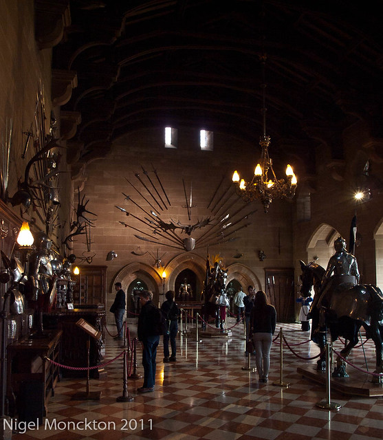
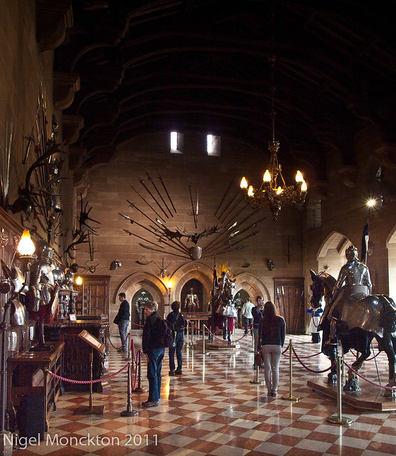
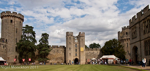
This is a picture I took at Warwick Castle when I was trying to inject some human interest into my shot – and failing.
This shot has minimal processing – a little sharpening and contrast enhancement - the top is too dark, the people are lost in shadow (but just visible enough to attract attention) and it doesn’t have a real point of interest. So what can be achieved? First up I tried to increase the visibility of the people by lightening the lower half of the photo to make it more consistent with the brightness of the wall. Tis was achieved quite simply in Lightroom using the Enhancement Brush tool.
This is a much nicer result - it’s still not the greatest picture in the world, but it’s clearly about the people visiting the Great Hall and I quite like the juxtaposition of the mounted knight and the people walking around the exhibit.
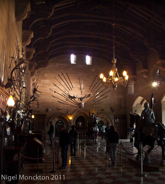
Turning the lighting scheme on its head a bit gives the following interpretation:
The structure and scale becomes much more apparent with the opening up of the shadows in the ceiling, the armour in the wall display becomes the centre of focus and the people shadowy bit parts in a story of heritage.
Thoughts
This exercise takes me close to the idea of thinking of a RAW image as being like a musical score – all the basic info is there but it can be interpreted to give a range of outcomes depending on the mood of the photographer.
This is another example of the overlap between exercise in this module - not a criticism, just an observation. I have previously posted this for Ex 17 User's Viewpoint, but it would work just as well for 'Making People Anonymous. It would be a very sterile image without the human presence, and a very different picture iof she were fully in focus and attractng more attention.
I took this picture in side St Pierre's Cathedral with the intent of using it for exercise 19, but it seemed to me to be between two stools – the people at the altar are too small as accent but large enough to draw attention, and the guy in the white jacket in the RH pews is also a distraction. So it seemed like an ideal candidate for rescuing in this exercise. The overall aim of the original was to lead the eye to the altar with its ‘haloes’ of light.
The exercise asks us for two new versions, one which de-emphasises the figures, and one that makes the more obvious. Here are both version – de-emphasised first (although it’s actually pretty obvious which is which):
In both cases I simply painted over the figures with the adjustment brush in Lightroom (set to a small diameter) and adjusted exposure/brightness/contrast until I got an acceptable result.
Reducing the brightness of the white jacket in the pews is beneficial in both shots, although I do think the ‘reduced emphasis’ shot now seems rather empty overall and less satisfying than the original.
In the ‘increase emphasis’ shot I not only brightened the figures at the altar, but also their surroundings so that they appear to be in a pool of light – the location of the artificial lights and the surrounding windows helps this to remain reasonably realistic in appearance. I also darkened the jacket in the pews and brightened the daylight playing onto the aisle. The former removes a distraction, the latter helps lead the eye to the figures.
This latter treatment feels like a dramatic improvement. There is now a very clear point of focus to the image where previously there were strong compositional elements leading your eyes to essentially nothing much.
Thoughts
Like most people who tinker with their digital photos I’ve done a bit of dodging and burning before – usually to recover shadow detail or try to save lost highlights. In DPP we were encouraged to remove and replace whole chunks of detail, but this exercise is somewhere in between. I’m not sure I’d have thought of this relatively subtle improvement without the need to find a suitable subject for the exercise – it’s clearly something worth thinking about with every shot – even if I end up concluding that it’s not necessary.
'via Blog this' When I first saw these images, before I started out with the OCA, I rather lightly dismissed them as rather mannered use of blur and perhaps double exposure. I revisited them in the light of the current discussion on cliche and realised how far off the mark I was in my initial thoughts. They aren't about the technique, they're about the guys feelings and he's used the kit and techniques he had available to capture those feelings. I'd like to think that this represents some kind of progress in my understanding of how to read a photo.
As a set I find them very difficult to look at - they seem full of lost potential, and yet, knowing how they were taken confirms that life moves on no matter what horrors we commit as a race. We need this sort of work to make sure that memory does not move on.
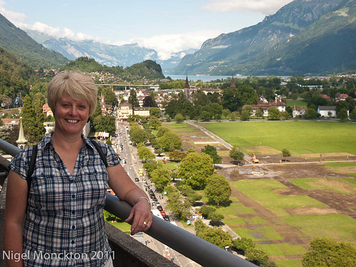
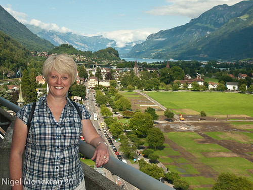
A classic technique for altering the balance between a person and their surroundings is the use of fill flash, as in these two shots of my wife at the top of the Metropole Hotel in Interlaken (I am just about finished with the shots I took in Switzerland for this course – just a couple more examples after this)
The change is not dramatic but I do think that my eyes rest more naturally on the scenery in the first shot and more naturally on my wife in the second.
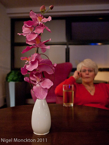
My second attempt at this exercise was at another hotel – this time in Manchester. The subject is clearly the pot of flowers, but I have tried to include enough of the surroundings to provide a sense of place. I have already used a shallow depth of field to move the attention to the flowers, but I think it quite noticeable that the figure has less impact in the shot where she is looking away from the camera.
This is a technique which is hard to analyse neutrally because of the degree of conscious mental engagement needed to make it work. For example. in these two shots, which I have already used in Exercise 20, does the inclusion of the second static figure reduce the emphasis on the individuals or simply draw the attention away from the surroundings? On balance I think the former is true – aided by the bright yellow coat in the middle of the second picture, but I’m not sure it is clear cut. I’m also completely sure that this exercise was nowhere near my conscious mind when I pressed the shutter.
It just struck me that this - which has appeared as 1000/657 on my npmimages blog - is a good example of making people anonymous. The picture would be nothing without human presence, but if I included the full figure it would be a picture of a person in an armchair - the rucksack would lose much of it's impact and significance.
This exercise is more challenging than immediately meets the eye. My initial thoughts were that these photos fit the bill – they were taken with this exercise in mind:
The figure in each case is anonymous as a result of being obscured, blur and silhouette respectively. However closer inspection of the exercise requirements requires that the images be primarily about place. Clearly the first two fail immediately. The third does have an identifiable place, if you know where MAMCO is, but fails – I think – on the basis that it tells you nothing about the space. So repeat after me – read the instructions!
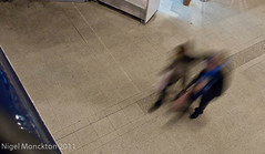
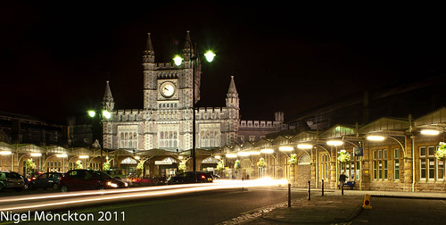
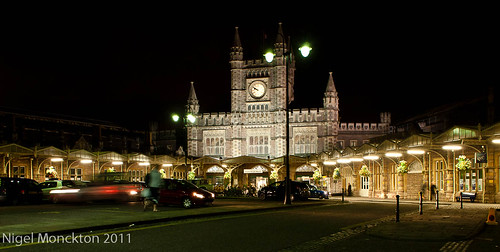
So next up – lets consider these two shots of Bristol Temple Mead
These seem to be getting closer to the mark. Given a little cultural background it could probably be identified as a railway station from the detail in the photo (although a city centre cathedral would run it a close second). The difference between the two is that one relies for its ‘life’ on a light trail, while the other has a blurred figure in the central foreground. In this particular shot I think that, although the second shot fulfils the brief, the light trail is more effective at adding life, but the second shot is a candidate for Exercise 23: Selective processing and prominence.
This silhouette is rather more successful. The shot is primarily about place – the silhouette is not dominant because of the low key nature of the shot, but adds humanity to an otherwise fairly empty scene.
.
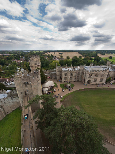
This shot of Warwick Castle makes use of the ‘small and many’ technique to establish scale and activity;
while this one relies on the fact that the most prominent people – on the battlement – are not only fairly small, but are facing way from the camera. This keeps the focus on the castle – in particular its height – rather than on the people themselves. It could be argued that this is simply another example of ‘many and small’, but I think the shot would be considerably less effective without the people on the battlement.
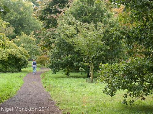
And finally two shots where this exercise and No 19 overlap. Both taken at Westonbirt earlier this year they are clearly ‘single figure small’ emphasising the scale of the landscape, and by being anonymous they are clearly seen as secondary to the landscape, although there is more than a hint of hidden narrative in the former.
Concluding thoughts
For years I have avoided people in my shots but time and time again this course has highlighted that as missing a creative opportunity.This particular exercise really brings that home. Virtually all of these shots would be less effective without people.
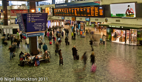
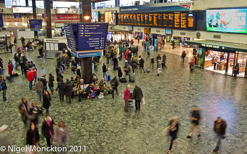
These first two shots were taken at Euston, right back as I was just starting this course – although they were taken with this exercise in mind. they were shot from the balcony of the ‘pub’ at one end of the concourse. There is a sense of movement caused by the relatively long exposure but overall I think they lack a real sense of business. The likely reasons are:
vantage point too distant and elevated – I was not even close to being comfortable shooting people at close quarters at this point in the course and the height emphasises the spaces;
insufficient people – an hour later might have been different – but trains times are what they are;
the people are too static – tis is down to the location. Most people are standing and waiting for their platform to be announced – a site near the entrance would likely be more effective.
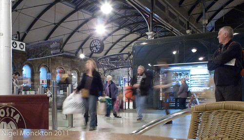
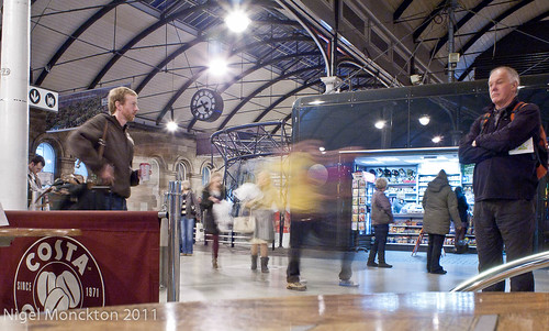
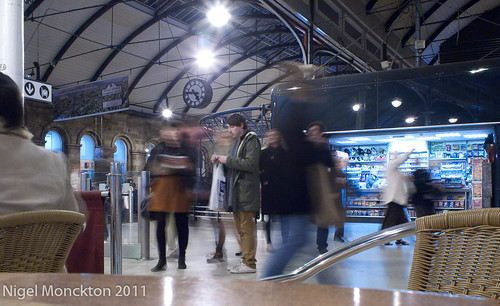
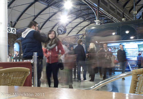
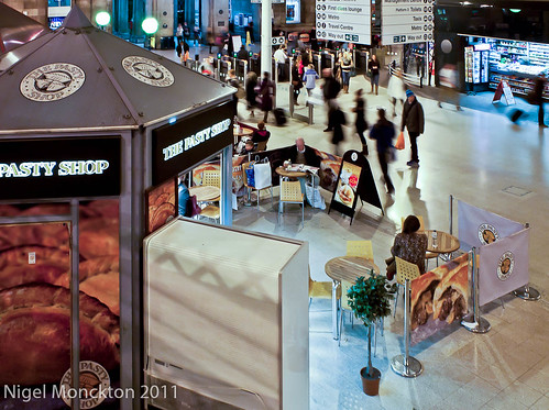
I repeated this exercise a couple of weeks back at Newcastle station after visiting the Turner Prize exhibition at the Baltic, with the following results:
These seem to me to be considerably better. There is more of a sense of being amongst the action, the people are sufficiently well defined to emphasise the contrast between the static and moving subjects and I am close to the entrance to the platform so there is actually more movement. I think the second and third are the most effective because they both contain a very static figure to contrast with the bustle around them. The shots were taken by resting the camera on a table in this coffee shop:
This comparison shot immediately shows the effect I noted in the Euston shots – the distance and elevation reduce the overall busy feel.
Conclusion
In the case of crowd scenes at least, motion blur gives a better impression of business when you are in amongst it – or at least quite close. Elevation reduces the effect further by emphasising floor space.
I seem to be labouring this course. Not sure why – it’s very busy at work currently, which doesn’t help. I guess I knew that anything with people in the title would be a challenge. Whatever – Assignment 3 is now on its way to my tutor.
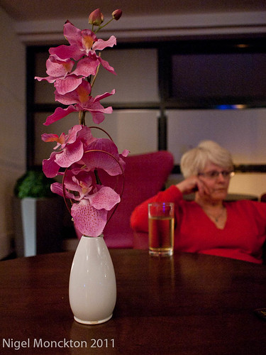
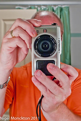
Thought I would include this in my Learning Blog as I consciously tried to bring some of my learning - in terms of eye placement - to the photo. Overall I think it is one of my better portraits to date although I wish I'd spotted the interior of the card (bottom right) before IU pressed the shutter.
An interesting site based on the merits of down-teching your photography in order to increase your creativity. Think I might paste this quote from his manifesto on my bathroom mirror:
Real output is judged by the reaction it evokes in the viewer.
Emotions are not measurable in print size or pixels. Spending
more on pixels may make a camera dealer very happy, but
usually does nothing for your viewer.