Planning
I struggled with this assignment and the more I ask myself ‘Why?’ the less certain I become. In part I think it is where my reasons for taking this course – to help me push my boundaries, particularly with regard to photographing people – met head on with those boundaries. I made several plans – my son’s band in concert, local blues festival, chilli festival, local agricultural show – and each time events conspired to bring me down.
In the end I have chosen to go with this set of photos which I captured in Switzerland. Even here I wrestled a bit with deciding if they met the various criteria before deciding that they do.
I was a little hung up on the idea of planning needing to be a long drawn out process. This, on the other hand, was a spur of the moment shoot on the first night of our holiday. We heard the sound of music coming from the village square so I grabbed my camera (with a standard zoom 28-108 equiv) a spare battery and spare memory card (a useful habit I got from the early parts of Digital Photographic Practise) and hot-footed to the square.
The music was, fortunately, a bit of warm up so the concert had not started properly. I chose a spot on the corner of the crowd so that I had room to move a bit, and an opportunity for a shot of the crowd as well. So in this sense it was planned – just very quickly.
The other decision was choice of film speed etc. I did not have a tripod so I concluded rapidly that stopping the motion in the rapidly fading available light was not a realistic option – so for the dancing and flag-throwing I simply went for a more impressionistic approach. In the choral shots it was a case of trying to find a balance between film speed and shutter speed while retaining sufficient DoF.
So was it planned? In my view – yes – and as I had this assignment in the back of my mind as I was taking the shots it was also deliberate. It was certainly one of the more technically challenging assignments I’ve tried.
The shots
As the programme was repeated I also had a chance to pick out a couple of more effective angles for explaining the activity and hopefully a couple of telling moments.
No1: The audience (Explaining)
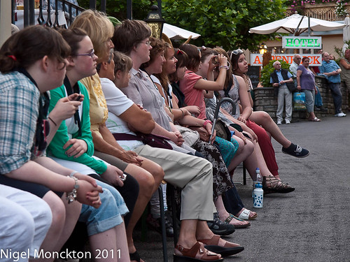
Exif: 1/30; f/5.6; ISO400: 51mm (102mm equiv)
I wanted a shot which made it clear this was a public event, and that focussed on the crowd as a ‘hook’ to encourage viewers to look further. I feel that a little more DoF might have been helpful, but as a ‘what’s going on here?’ introduction it works reasonably well. It leads nicely into:
No. 2: The Village Square (Explaining)
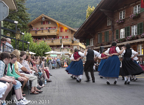
Exif: 1/15; f/5.6; ISO 400: 22mm (44 equiv)
This shot has just enough blur in the dancers to explain what is happening, while the buildings and national dress etc immediately suggest Switzerland/Austria or perhaps northern Italy.
It’s a shame that the young lady at bottom left is not looking at the event – but otherwise I think this works very well and if I was restricted to exactly 10 shots (rather than approx 10 as the course notes require) I would probably use this as the introductory shot.
Shot 3: Dancing (Explaining/Telling Moment)
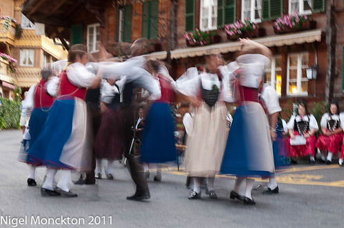
Exif: 0.6sec; f/9; ISO100; 35mm (70mm equiv)
I thought long and hard about including this shot as the shutter speed is so slow that there is clearly camera shake as well as blurred movement. The choice of shutter speed was deliberate to provide quite a bit of blur in the dancers, but the shot would have been improved if I had had some camera support available.
I included it because, as far as I could tell, this twirling motion was a key feature of the dance and I wanted to include this effect, and I also happen to like the way the gentleman in the dark suit appears in a gap between two of the dancers perhaps hinting – in the context of this series – at other things to come.
Shot 4: Dancers (Telling moment)
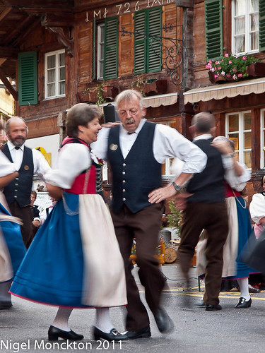
Exif: 1/13; f/5.6; ISO400; 54mm (108 equiv)
I included this shot because I wanted a close-up of some of the dancers and this particular shot seemed to achieve the right balance of sharpness and blur. To my mind it captures the concentration of the dancers – both have their eyes shut – at the same time as some sense of pleasure. I also like the slightly out-of-keeping modern wristwatch on the mans arm.
With a longer lens I might have pulled in closer on their faces, but then camera shake would have been even more of an issue.
Of course – it’s not possible to have a dance without music so the next shot captures the musicians.
Shot 5: The band (Explaining)
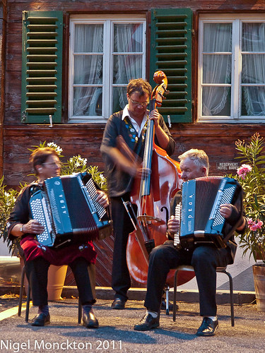
Exif: 1/6; f/4.5; ISO1600; 54mm (108 equiv)
Apart from the double bass player this is quite static compared to the dancing shots. In the context of the series this is not necessarily bad as it acts as a transition from the dancing to the choral section of the performance but in fairness I believe this shot could have used a little more motion blur. It is a useful learning point that I should believe the screen less and duplicate even those shots I think I have in the bag first time! I can always delete the duplicate later. It has been cropped fairly heavily to make up for the limited reach of my standard zoom.
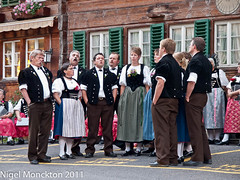
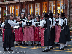
Shots 6 and 7: The Choirs (Explaining)
Shot 6 (LHS) Exif: 1/15; f4.5; ISO400; 54mm (108 equiv)
Shot 7 (RHS) Exif: 1/10; f/5.6; ISO800; 54mm (108 equiv)
I include these shots together because they are very similar in composition but quite contrasting on closer inspection. The mixed yodelling group is considerably more casual than the ladies folk choir. I especially like the fact that they all have their hands in their pockets, and there are a range of exchanged glances between the yodellers, whereas the ladies choir is paying attention to the conductor in a much more disciplined way.
Shot 8: Alpenhorn Player (Telling moment)
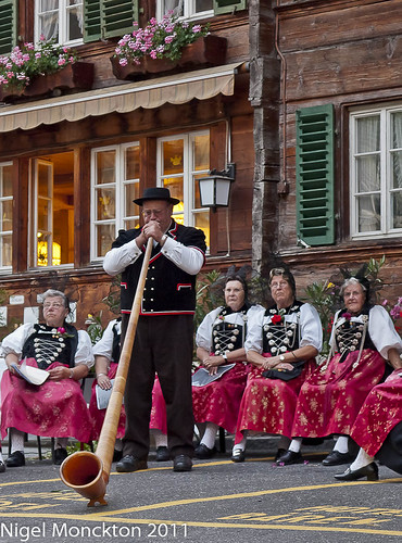
Exif: 1/30: f/3.3; ISO400; 41mm (82 equiv)
I include this as a telling moment because it was a high-point of the performance and one the crowd clearly wanted to hear – judging by their expressions I’m not sure the same could be said of the ladies choir. This appears to be a relatively straightforward shot of a static subject, but in reality it is a heavy crop from a photo that included both the horn player and the flag-thrower. For this shot a longer lens would have been useful, although I think the quality has held up reasonably well. Had the opportunity presented itself I would also have liked to try a wider angle lens much closer to the mouth of the horn – but, equipment availability aside, there is a limit to how far I am prepared to impose myself on a public performance. With hindsight I also wish I had had the courage to approach the gentleman afterwards for some closer shots.
Shots 9, 10 and 11: Flag Throwing (Explaining and Telling Moment)
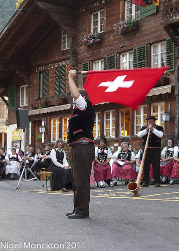
Exif: 1/25; f3.2; ISO400; 28mm (56mm equiv)
(Telling Moment) This was a matter of fairly precise timing as it was difficult to establish a shot where the Swiss flag was unfurled and moving slowly enough to register in detail. This is the first of the sequence to unequivocally establish the location as Switzerland – without this shot we are left to guess at the location.
I have cropped the photo fairly heavily to concentrate on the flag-thrower, and in the process I have created an internal frame for the alpenhorn player – who was accompanying the action. This might have been performed more effectively by use of a longer focal length. The next shot – taken from further to the left establishes their relationship even more effectively.
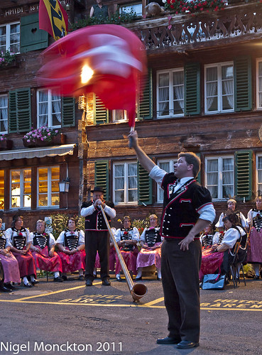
Exif: 1/6; f4.5; ISO800; 29mm (58 equiv)
(Explaining) The blur clearly shows that there is some flag waving going on. The flag-throwers arms almost form a nice triangular composition with the alpenhorn – I have missed this by a fraction of a second, although there is still an implied triangle out to the tip of the flag. I was somewhat braver and got in a little closer this time, which meant the crop was much less extreme.
The final shot of the series is definitely a Telling Moment. The thrower does as the name implies and throws the flag in the air – catching it as it comes down. I made use of the relatively still spot at the top of the throw to capture this last shot.
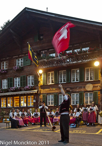
Exif: 1/10; f/4.5; ISO800; 19mm (38mm equiv)
Again there is quite a strong implied triangle, which in this case adds to the sense of movement and the spectator on the balcony is an added bonus.
Converging verticals
In the feedback on assignment 1 my tutor suggested that I needed to pay more attention to converging verticals. This assignment was quite challenging from that perspective as the camera angle was generally quite low and there were a number of tall buildings with strong construction lines in the background. To address this in a number of the shots (2,8,9,10,11) I have corrected the perspective using a piece of software called Shift-N, and the end results are definitely more satisfying. The alternative in this circumstance would have been to include more foreground, and crop accordingly – which I think would have been an unhelpful distraction. My shooting skills are not yet up to composing in half the frame, and although a software alteration always implies some loss in quality, I think the loss from cropping/enlarging would have been greater. That said - it’s an issue I need to work on.
Overall review
Technique – Some camera support would have improved shot 3 in particular, and I could perhaps have risked ISO1600 for the choir shots, which on close inspection show some subject movement. I could also have used a longer focal length in some instances to reduce the need for cropping. However overall I believe I have delivered a product that met the technical challenges of the assignment – to capture a series of images explaining an activity which includes some telling moments.
Creativity – I could be open to the charge that this is a rather predictable or clichéd subject. While accepting that it is effectively an activity laid on for the benefit of tourists (and so potentially a cliché) I have tried, by use of appropriate technique, to say something about the activity beyond the ‘Ooh look! People in national dress’ approach. I feel this was least successful in the shots of the choirs and most effective in the case of the dancers.
Insight – I feel there is an interesting back story to these shots that I have been unable to explore. What do these people do for a living? Does their lifestyle reflect their interest in traditional art forms? Do they practise in their performance clothes, or in modern dress – and do the activities leave the same impression in that case? As a tourist it is difficult to explore these issues, but I feel there is a potential idea here for a future course or a personal project, even if not in Switzerland.