Tuesday, 21 June 2011

Exercise 19 – Single figure small

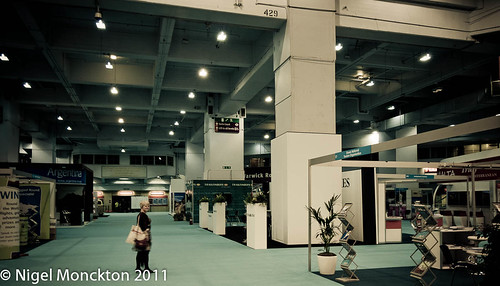
Rolling on with this exercise here are a couple I took with this theme directly in mind. First up a shot inside Earl’s Court during a travel show in February. We were among the last to leave so I caught my wife dwarfed by the surroundings:

Single figure small (ii)

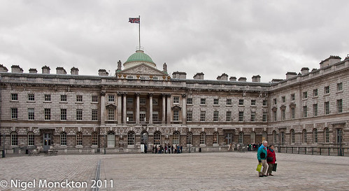
And a second taken during the same visit inside the grounds of Somerset House. Technically not ‘single figure’, but the visual impact is not much altered by the fact that there are two people.

Single figure small (i)

In both case the shot would be rather dull without the human presence – in the first case a large, partially empty box and in the second a sea of grey stonework.

More recently we visited York for long weekend and as we were walking around the city walls I spotted this shot looking down at the railway station. I particularly liked the way the building cascades down in layers to the small figure at the bottom. For the record I’ve cloned no-one out of this shot the other people and vehicles moving around the station precinct were – for a few moments – hidden behind all the buildings or just out of shot. Sometimes you have to be a bit lucky.

York station

Thoughts

Have caused myself a certain amount of personal angst with the dawning realisation that many of my shots are a bit sterile because of my inclination to exclude people. There is obviously a case for shots without in some circumstances, but not including them at all removes a significant creative tool to give my photos a bit more life.

Monday, 6 June 2011

Exercise 18: How space changes with light

I find this a particularly interesting exercise with far more aspects than the text suggests so i think I may be coming back to it several times.

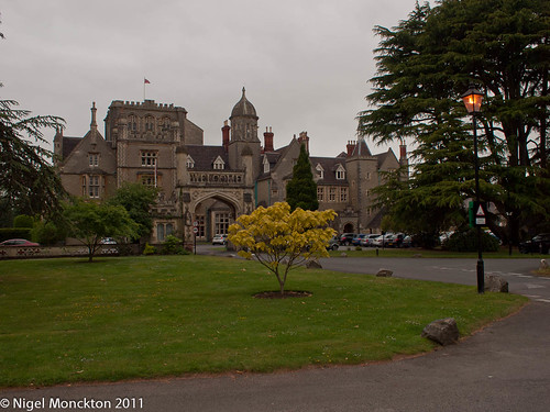
As a first pass I going to take the instructions at face value with a series of shots of one of the hotels I regularly visit on business, the Tortworth Court, near Wotton-under-Edge.

This is clearly a very imposing building, and is probably going to look so irrespective of the lighting. However, this first shot at 08:00 on an overcast summer morning does it’s best to make the building look dull. I tried lifting it with some fill light slider in Lightroom, but that simply reduced the contrast, and I also tried a couple of HDR–effect presets but they also offered little improvement. In as much as it has any effect the sun is behind me to the right.
Tortworth Court 18:2

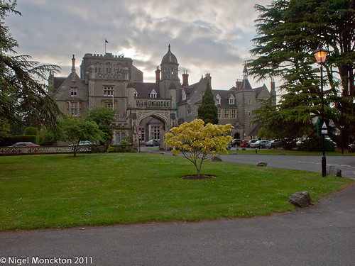
In this next shot, taken about 12 hours later at 19:45 the same day, the sun has moved around behind the building, although the sky is still largely overcast. Rather than try for a silhouette I have chosen to lift the building and pull the sky back to give a semi-HDR effect. Although the light on the building is again very flat it is considerably more interesting than the first shot, with perhaps a sense of foreboding to it. In both these shots the colour temperature of the light does the stonework no justice at all.
Tortworth 18:3

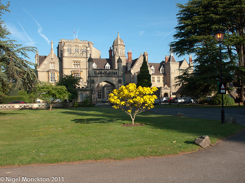
The next shot shows how sunlight brings the scene to life – this one taken the next day at 07:30, and overexposed by 1 stop relative to the recommended exposure.
Tortworth 18:4

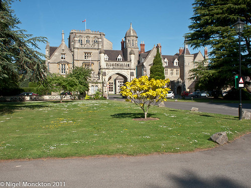
The low and bright sun has started to show some relief detail on the main building, the heavy shade cast by the trees to my right have dulled down the entrance gate so that it appears part of the main building, and the same shade sets off the small tree in the foreground quite dramatically. The morning light also compliments the colour of the stonework. This is my favourite shot from this series as captures the feel of the hotel very well. Just an hour and a half later later, at 09:10 the shot starts to have a different feel.
Tortworth 18:5

The shadows have shortened noticeably, and moved so that they no longer set off the small tree. The changed lighting angle has also reduced the apparent relief relief in the stonework. The gate is now more prominent, but perhaps rather dominant. Finally, the colours are also less saturated. All this adds up to a rather less engaging picture in spite of the continued drama of the hotel itself.

By way of complete contrast here is the same shot at night. Dracula anyone? The floodlighting nicely highlights the buildings texture and detail, the foreground is softened (slightly) by the street light falling on the tree and the colours are un-natural but warm. Without the tree this could have been taken in virtually any season of the year
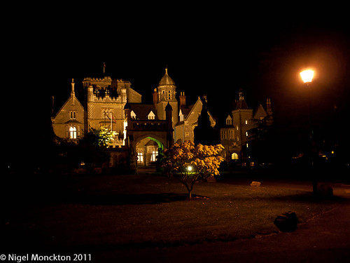
Tortworth Court 18:1 

Conclusions

I will have plenty more opportunities for shots of this location and as I have used a road marking to locate the camera position I would expect to be able to repeat the view so I will be revisiting this, and hopefully adding some shots from the middle of the day.

I will also be looking at the effect of light on a rather more modern building – although these are in somewhat short supply in rural Cumbria – and I have some thought about carrying out the exercise in a hopefully more creative way.

Exercise Update  - 02 July 2011

Overcast seems to be the order of the day this summer as this next shot taken at about 10:20 in the morning shows:
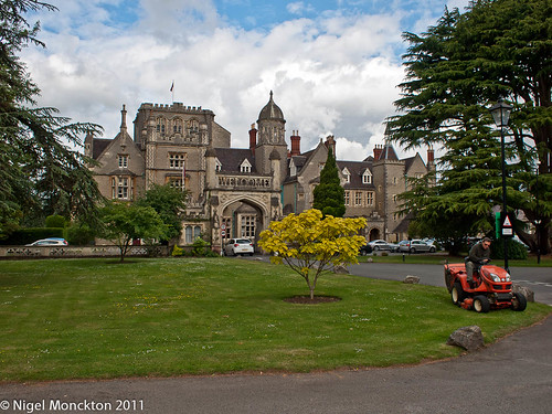
Tortworth 18:8

The loss of sunlight compared with the two shots above makes this a considerably less attractive photo, but it is a definite improvement over the first shot. This is in part because the clouds and sky are more interesting, and also perhaps because the sun is higher so more light is filtering through the clouds. For comparison, here is the same shot at 17:14:

Tortworth 18:7

Even in these relatively overcast conditions the deadening effect of the sun moving behind the building is clear.

Overall conclusions

In truth, in this series of shots it is not always easy to distinguish between the effect of different times of day and the effect of weather conditions. It is most marked in the two sunlit shots – and of course the night-time shot – although while the building is floodlit there will be little change with time.

Given an intermittently cloudy sky the shots look better with front lighting. Unfortunately I get few opportunities to photograph this building during the middle of the day, when the sun would be coming from the left of the shot. If the opportunity arises I’ll post it here.
Tate Modern| Future Exhibitions | William Klein/Daido Moriyama

Bookmarking this – it’s a long way off and hopefully I’ll have completed this course well before then – but still worth a visit.
Tate Modern| Future Exhibitions | William Klein/Daido Moriyama

Sunday, 5 June 2011

Exercise 13: A standard view

For this exercise I’ve tried another trip into Keswick – on a rather more pleasant day, and market day at that, so lots of people around. I found this exercise more intimidating than Ex11, largely because you need to get a lot closer to the subject to fill the frame. I have started to get the hang of shooting on the move without making eye contact, although it still feels intrusive and I’ve yet to really get close enough to start frame filling with a head and shoulders. Oddly I had the opposite problem to previous attempts i.e. there were sometimes so many people that I couldn’t keep moving fast enough to feel comfortable.

Early on in the afternoon I also had a little trouble getting shots in focus.  I had the camera set to auto-iso (upper limit 800), f/11 and manual focus at around the hyperfocal distance, so I was a bit baffled until I realised that I had the camera set only to shoot when there was a confirmed focus – which simply blocked some shots - and that I had to be careful not to move the focus ring by accident.

Anyway here are the best of the bunch. They have all been processed with a preset I like in Lightroom – the slightly muted colours, relatively low contrast and key seem to fit the mood better than the unprocessed version.

Keswick 13:1         Keswick 13:2       Keswick 13:3 Keswick 13:4  Keswick 13:5  Keswick 13:6Keswick 13:7

My personal favourites are the first one, because the newspaper headline caught my eye – although a longer focal length would have been better – the two oriental tourists peering into their cameras – a bit blurred but I still like it – and the last one of the family in the park. In this last example I actually heard one of them ask ‘Did he take our photo?’ as I walked by so it was a bit of a confidence boost to find no-one chased after me!

Thoughts

Most of my thoughts have been expressed in the intro paragraphs. the shorter focal length was more intimidating so I didn’t get the portraits that I achieved with the long lens. Had I used the long lens with the traffic density I had today I think I would have suffered from people getting in the way. I think that I might , with practise get to the point where the 17mm(34mm equiv.) on my PEN felt quite natural, but anything wider than that will require a crowd at an attraction. So time to research some locations for Exercise 12.

Exercise 17: The user’s point of view

Although I have yet to start the exercise it is clear from the text of Exercise 16 that one of the keys to effective photography of spaces and buildings is to understand their purpose, the way they are actually used and – the development in this exercise – the way they are perceived by a user.

It would be simple to fill this entry with shots taken at random in various buildings – arguing that as I was in the building, I was a user, therefore any shot I take is a user’s viewpoint, but on the basis of the thought above I think that clearly misses the point.

I have a book on Zen meditation – Learn Zen Meditation, by David Fontana – which contains an exercise about expressing the ‘catness’ of cat in a ‘Zen’ painting. The basic instructions are to sit and meditate on what it is that makes a cat a cat, load up the brush, and when the image is clear in your mind open your eyes and commit it to paper. There seems to be a measure of that in these exercises.

First up is this shot taken in a tea-room in York. Tea-rooms are a place to take shelter from the world outside, catch your breath, and give your feet a rest – so a shot which captures some tranquillity or cosiness would seem to be needed. In addition, they are normally experienced seated so a shot from reasonably close to a table top is called for. I went for a very wide angle to ensure as much in shot as possible to capture the idea of sitting inside while the world went by outside. I also chose a relatively large aperture (f/5.6) and focussed close in to ensure that even with a focal length of 7mm I still blurred the background enough to give a sense of separation.

Bailey's tea room, York

Of course, tea-rooms are also places where you drink tea, and the absence of tea from this shot could be seen as an omission.  However I think that the inevitable clutter of crockery, cutlery and cakes would distract from the overall feel of the shot.

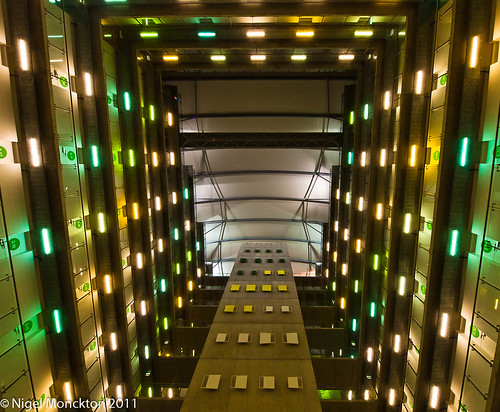
Next up, and by way of a total contrast, is the Abito Building on Salford Quays. Essentially an apartment block with a huge internal space and apartments on three of the four sides the first look up as you enter the building is breathtaking. There was no pre-meditation in this shot. To be honest there is really only one option for shooting this – with the camera on the floor pointing upwards and an ultra-wideangle to capture as much as possible. Another shot at 7mm, but this time stopped down to f/11 to ensure focus all the way up.

Abito Building, Clipper's Quay, Salford Quays

It would be easy to be cynical shooting a users view of a building such as this. There are plenty of opportunities for shots of concrete landings, lift doors, anonymous stairwells and other clichés. It could be argued that lying on the floor is technically not the users viewpoint, but in truth the upwards view is pretty much like this, and this is certainly true to the effect on a first time user. I was impressed - and I hope it shows.

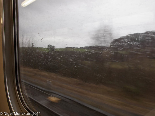
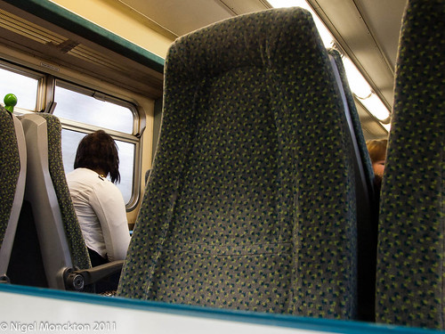
Going to finish with a trilogy of shots of something less impressive – the interior of a Saturday train from Carlisle to Newcastle. Trains are relatively cramped spaces, and when you are seated the view in most directions is blocked by seating. In dull conditions even the view outside is obscured by reflections, and of course, you are always conscious of movement. These are the impressions I have tried to capture in this set.

On the Newcastle train (iii)On the Newcastle train (ii)On the Newcastle train (i)

Conclusion

There are millions of ‘spaces’ in the world, and user experience and viewpoint will vary with the individuals using these spaces, influenced by both their physical stature and their state of mind. If it had been pouring with rain outside, the windows steamy and the streets filled with umbrellas, I would have taken a very different shot of the tearoom, after several months in the apartment building I might be less awestruck when I looked up and if I was trying to sell train journeys I might be looking for a sunny afternoon in a train full of happy smiley people.

The key point is that careful consideration of your reaction to the space means you can select techniques and angles/compositions that properly reflect your experience of it.

Wednesday, 1 June 2011

Assignment 1: Feedback and reflection

A bit of a delayed response on my part but I’m pleased with the positive and constructive feedback I received for Assignment 1.

Photo 1:

PnP Assignment 1 (1 of 7).jpg

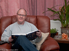
Norman has suggested a slightly higher camera position, to avoid the impression of looking down into the camera, which as an issue I’d not thought of, and advised that:

For a close portrait in this format, it is a general rule to have the right corner of the eye as the midpoint in the composition. This is normally done in the cropping stage at the time of shooting or in post processing.

I’ve tried fiddling with the crop and can’t make it work on this image, so I’m thinking reshoot for this one. That would enable me to address the camera angle as well.

Photo 2

PnP Assignment 1 (2 of 7).jpg

Norman agreed with my assessment that this was possibly a little flat, lighting-wise, and also picked up the strong horizontal that runs through the eyes, although he described this as ‘hyper-critical’. Overall however he appeared to like the shot.

I have received other feedback that this shot is a bit too tightly cropped – which is a comment I received on a couple of my shots in DPP1. Obviously something I need to watch out for.

Photo 3

PnP Assignment 1 (3 of 7).jpg

Not much to say on this image other than to note that I have again been successful in avoiding reflections in my glasses.

Photo 4

PnP Assignment 1 (4 of 7).jpg

Not unexpectedly Norman commented that normal posing for a portrait would have the subject looking into the shot. Happy to accept this advice, but in this particular instance I was trying to emulate a style that was popular in corporate photography in the not too distant past. It is still suggested as a way to ‘perk up’ portrait photography – see here (Tip 2) for example, and has been used by such luminaries as Ida Kar, albeit in a very different context.

Norman also suggested dipping the head as a way to reduce the reflection in my glasses. If I can’t pp my way out of this I’ll probably reshoot for that reason.

Shot 5

PnP Assignment 1 (5 of 7).jpg

Norman did not share my concerns about the highlights in this shot , saying:

I don’t believe this could have been improved in any way.

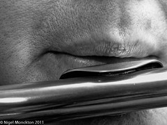
Despite this response – which is obviously pleasing – I wonder if this will be difficult to print in a pleasing way. Perhaps a textured paper, which would also compliment the skin detail might be the answer.

Shot 6

PnP Assignment 1 (6 of 7).jpg

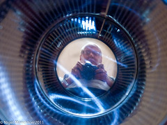
Described as ‘imaginative and unusual’ which is good because I sometimes think I struggle to be imaginative.

Shot 7

PnP Assignment 1 (7 of 7)

Again the comments were positive but beyond that not much else to say. I’ve tried this technique again, with the results here.

Other material

Norman has also suggested investigating the work of Joel Grimes, Dorothea Lange and Mark Cleghorn which I’ll be doing in the near future.

He also provided a link to this tutorial site:

Conclusion

Overall I’m reasonably pleased with the feedback. There is a range of useful tips, some interesting photographers to explore and plenty of food for thought.