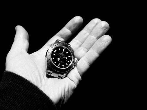
I posted this on my photo-a-day blog but I feel it belongs here as well. Have been interested in Ralph Gibson ever since one of the tutors (thanks Clive) threw his name 'casually' into a conversation. He has a very distinctive signature style featuring very deep blacks and strong contrasts and I especially enjoy the graphic nature of his images and the way he plays with space and form. Interestingly, especially in view of the advice we usually receive, he also has a couple of mixed colour/b&w sets on his website, but even the colour sets are quite high in contrast and have the same focus on form and shape.
Anyway - to cut a long story short - I was having a good look around his website and came across a shot in Die Nacht which I liked so much I thought I'd have a stab at my own take. A couple of points – his shot was clearly of someone else's hand unless he had a cable release, and I struggled to get the range of skin tones that he managed – I suspect this may be down to the light source, which in my case was quite hard. In some ways I regret using a watch as the ‘object’ because it now feels too much like a copy – I think it could easily be brought up to date and retain the impact by using perhaps a smart phone or a PDA instead. However, in fairness to myself, it was a spur of the moment idea sparked by the website, and it’s worked better than I expected.
There are a couple of colour shots in my archive that I was reminded of while browsing his website, so I think I’m going to dig some out and compare them in colour and with this treatment to see how the impact varies. Somewhat unexpectedly I find that black and white is featuring more and more in my everyday photos and I’m hoping that this kind of contrasting of colour and b&w images will help me understand why – is it just the pleasure of the ‘new’ or is it something more fundamental?

No comments:
Post a Comment